

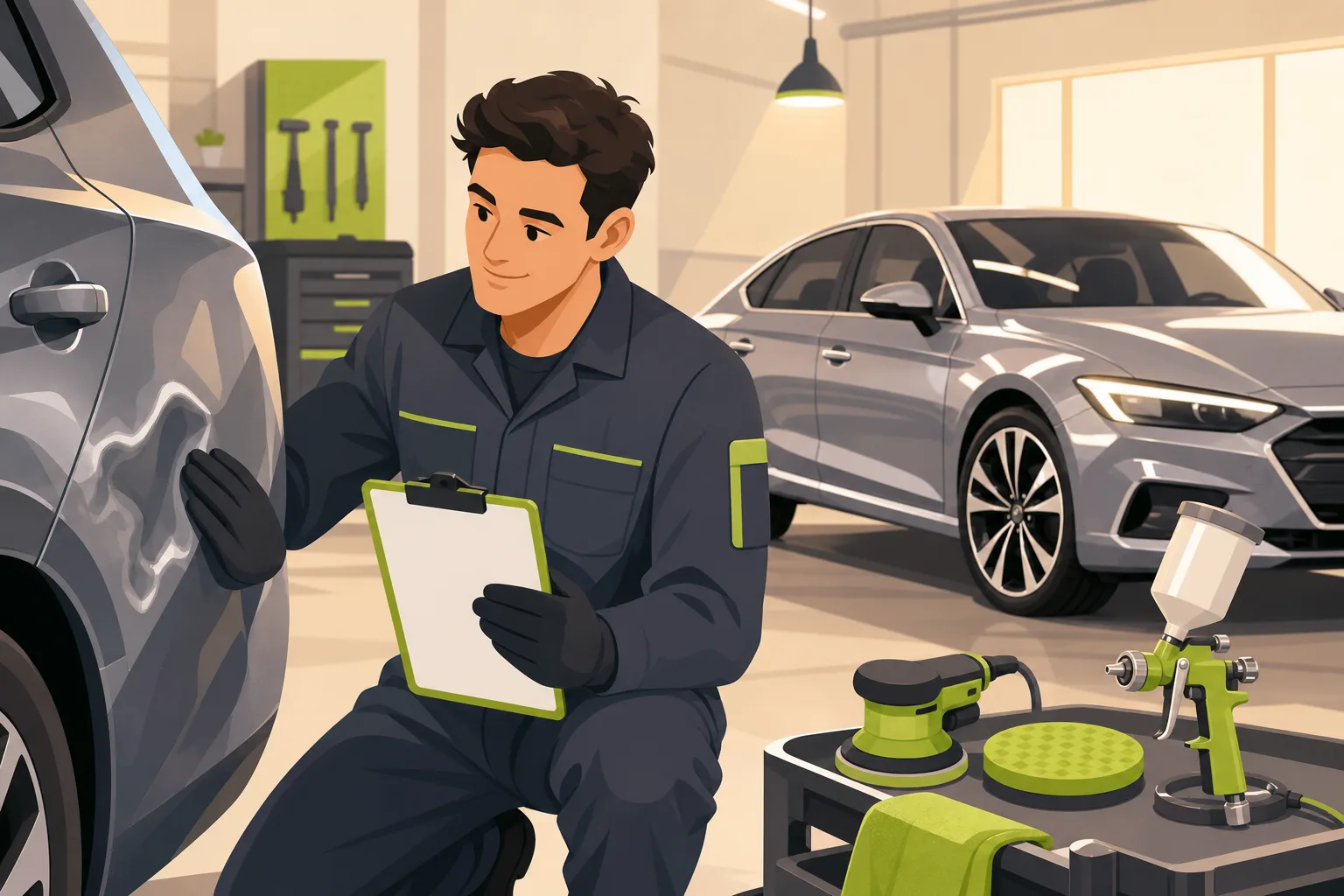
Your customer just got into an accident. Their car is drivable but damaged, their insurance company gave them a list of "preferred" shops, and they're Googling alternatives from the tow truck parking lot. They're stressed, on a timeline, and they're going to call the shop whose website makes them feel the most confident in about 90 seconds of scrolling.
That's the entire ballgame for auto body shop websites. And when we analyzed top-ranking auto body shop websites from all over the country, we found a striking divide: a handful of shops have figured out exactly what stressed, insurance-dealing customers need to see — and the rest are missing most of it.
Here's what we found, and what it means for your website.
The Customer's Actual Mindset When They Find You
This matters more than any design tip. When someone lands on your website after an accident, they are not casually browsing. They are:
- Stressed and time-pressured (rental car situation, insurance deadlines, car payment still due)
- Skeptical of their insurance company's "preferred" shop recommendation
- Worried about getting a bad repair — paint that doesn't match, structural work that's not safe
- Unsure how the whole process works
Every piece of your website should answer one of these concerns. If it doesn't, it's friction.
The best positioning line we found in our entire research of auto body shop websites captures this perfectly. One Nashville shop uses the phrase "We work with insurance companies, but not for them." That's not just a clever line — it names the exact fear customers bring to your website and resolves it in nine words.
What We Found Analyzing Real Auto Body Shops Across the Country
We looked at shops across multiple US metro areas including Austin, Denver, Phoenix, Charlotte, Nashville, and Tampa. The range was wide — from a 151-page site with carrier-specific landing pages and a video hero to a thin Wix build where the hero image was literally an AI-generated PNG (the filename started with "ChatGPT Image Mar 17, 2026..." — customers notice this stuff).
Here's what separated the winners from the rest:
Phone number repetition is not optional. Every top-performing site in our analysis showed the phone number four to eight times per page. Not twice. Not in the footer only. One Phoenix shop displayed its number eight times on a single page. On mobile, every one of those was a tap-to-call link. This sounds excessive until you remember that your customer is standing next to a damaged car wanting to talk to a real person. Make it trivially easy.
Lifetime warranty language is table stakes — not a differentiator. The best auto body shop websites we've analyzed use lifetime warranty language consistently. Exact phrasings included "backed by a lifetime warranty on workmanship for as long as you own your vehicle," "LIFETIME WARRANTY on all auto body repairs," and one memorable line: "If it's not right, it doesn't leave the shop." If your website doesn't say this clearly and without an asterisk, you have a gap. An asterisked or hedged warranty reads as a red flag in this category.
OEM certifications are the category's credibility currency. One Denver shop shows 30+ brand certifications including Lamborghini, McLaren, and Maserati. A Charlotte shop shows 25+ including Tesla and Acura. A Colorado shop leads with "Certified Auto Body Repair" in its hero headline. These logos communicate something specific: your technicians have been trained and tested by the manufacturer to repair that brand's vehicles correctly. That matters enormously to a customer who just wrecked a leased SUV.
Process steps reduce anxiety more than any other single section. One Phoenix shop lays out the entire repair experience in six steps. A Nashville shop uses four: Damage Assessment → Approve → Fix → Pick Up. Customers who don't know what happens after they drop off their car are customers who hesitate to call. A simple process section dissolves that hesitation.
Review counts should be specific numbers, not vague language. "439 reviews on Google with a 4.9 star rating." "450+ Google Reviews." "Over 300+ 5-Star Google Reviews." Specific counts beat vague claims like "hundreds of positive online reviews" — which one Charlotte shop actually used. Across our proprietary local-business website research, showing a specific review count near the top of the page is one of the most consistently underused conversion improvements in local service categories.
Before/after photos are the proof. Customers are evaluating your paint-match quality, your panel alignment, your masking lines — from photos on their phone. The shops with dedicated before/after gallery pages (one Nashville shop has it as a nav-level destination; one Charlotte shop has 12+ photos inline on the homepage) are giving customers the visual evidence they need. An AI-generated hero image or a stock city skyline in place of real shop photography is visible to customers and it damages trust.
What Your Website Actually Needs
Break this into two lists: what you must have to be competitive, and what actually separates you.
Table stakes — every serious shop has this:
- Phone number in the sticky header, repeated at every section break
- "Free estimate" CTA above the fold (increasingly with a photo-upload option)
- Lifetime warranty stated clearly, no asterisk
- "We handle your insurance claim" messaging + insurance carrier logos
- Services grid: collision repair, auto painting, paintless dent repair at minimum
- Reviews section with a specific count and star rating
- Years in business / family-owned framing somewhere visible
- Hidden pricing, with the estimate form as the only conversion path
What actually separates winners:
- A short process-steps section (four to six steps) that walks customers through the experience
- OEM certification logo wall — relevant brands for your positioning
- Before/after gallery as a dedicated section or nav page
- Consumer-advocate framing: you work with insurance companies on the customer's behalf, not the insurer's
- Real shop photography — paint booth, techs at work, vehicles in various repair stages
For auto repair shops generally, we see the same pattern: the shops that communicate process and credentials clearly are the ones that convert comparison-shoppers. Our research on auto repair shop websites found nearly identical dynamics around trust signals and phone-first conversion. And if you're in a hail market specifically, check how we think about auto detailing sites — the visual proof requirements are similar.
The Mistakes We See Most Often
Vague headline with no proof point. "Masters of Quality" tells a customer nothing useful. "Trusted [City] Collision Repair Since 1988" does three things: tells them what you do, where you are, and establishes credibility. The formula that works: trust qualifier + service type + city + verifiable proof ("Since 19XX" or "X+ 5-Star Reviews"). Avoid two extremes we see across auto body shop websites: the slogan that says nothing, and the keyword dump that reads like an SEO title tag stuffed into an H1.
Credential walls without photography. Several shops in our analysis had excellent certification pages — manufacturer logos, I-CAR Gold Class designation, ASE credentials — but almost no real repair photography. Credentials prove competence. Photos prove it emotionally. You need both. Customers don't know what I-CAR Gold means, but they know a perfect paint match when they see one.
No process section. The insurance-claim process is confusing to most customers. Shops that explain it — step by step, in plain language — remove the anxiety that keeps people from calling. A numbered four-step section is one of the highest-value things a shop can add to a homepage, and most sites still don't have one.
Hail damage treated as an afterthought in hail markets. The top Denver-area shops we analyzed led with hail damage either in the headline or as the first service listed. If you're in a market with meaningful hail seasons, hail damage repair deserves its own page and its own mention in your hero — it's the trigger for an enormous share of claims in those areas.
Stock photography or AI imagery in the hero. We flagged one Nashville shop as a cautionary example: the hero image filename literally identified it as AI-generated. Another Tampa shop used a city skyline stock photo. In a category where customers are judging your quality from your images, generic or artificial photography actively works against you.
Quick Checklist Before You Go Live
- Phone number visible without scrolling, tap-to-call on mobile
- Lifetime warranty stated clearly in the hero or directly below it
- Free estimate CTA above the fold
- Insurance messaging: "We work with all major carriers" + carrier logos
- Process steps section (4–6 steps)
- OEM certification logos relevant to your shop's tier
- Specific review count with star rating
- Real shop photography — no stock, no AI images
- Before/after gallery (even 8–12 photos)
- Years in business visible
If You're Building Your Auto Body Shop Website
The GrowLocal website builder for auto body shops is built around exactly these patterns. We've looked at what the top-ranked shops in multiple markets actually do — the headline formulas, the trust signals, the conversion sequences — and we build that structure into every site. You get a complete, professionally designed site built to convert stressed, insurance-dealing customers, preview it free before committing, and keep it for $20–30/month. We build everything — you don't touch code.
Browse our full category library to see what we've built for other service businesses, or go straight to the auto body template to see exactly what your site would look like.