


Updated June 2026
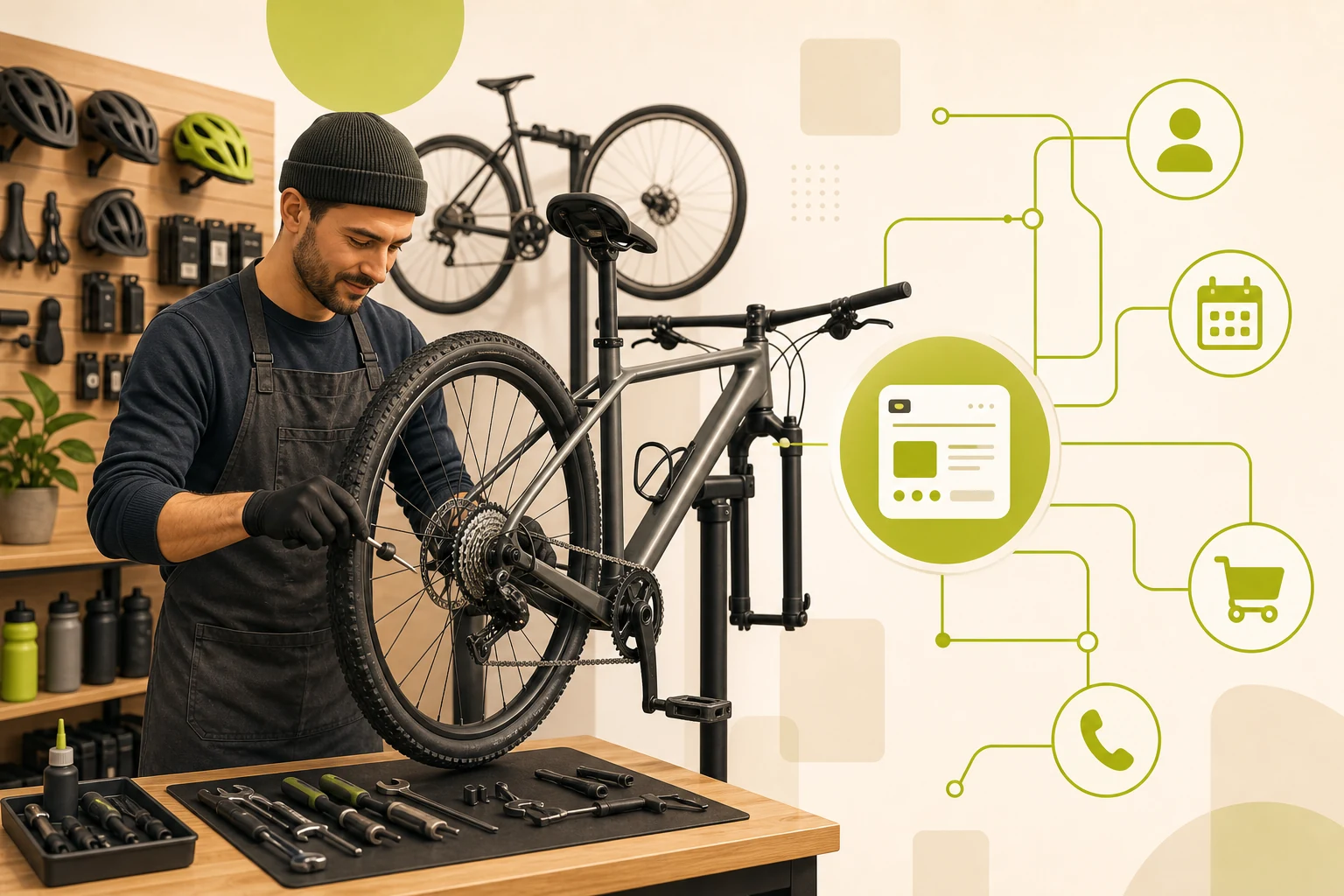
A complete bike shop website checklist covers seven non-negotiable elements: dual primary CTAs (Shop Bikes + Book Service), a dedicated e-bike service page with motor certification callouts, transparent service pricing tiers, real photography, brand-partner logo strip, location details above the fold, and a community/events section. Generic website checklists miss every one of these. This guide covers exactly what a local independent bike shop's site needs — and what the top-ranking shops all have in common.
This is based on GrowLocal's proprietary research into top-ranking local business websites, including independent bike shops across Austin, Denver, and Nashville.
What should a bike shop website include?
Most "website checklist" guides are written for generic small businesses. A bike shop has two distinct customer modes — the rider with an urgent flat tire and the buyer spending weeks researching a $3,000 gravel bike — and your website needs to serve both simultaneously.
The seven must-have elements below reflect what separates the shops that convert visitors from the ones that lose them to the next Google result.
1. Dual CTAs in the header and hero — not one, two
Every top-performing bike shop site runs two primary calls-to-action: one for product discovery, one for repair conversion. In GrowLocal's proprietary research into top-ranking local business websites, every high-performing shop had both "Shop Bikes" and "Book Service" (or "Schedule Repair") as equal-weight hero CTAs.
Why it matters: the repair customer and the new-bike buyer are completely different people with completely different urgency levels. One CTA forces the wrong one to hunt. When you make a visitor work to find the right path, they leave.
The dual CTA should live in:
- The sticky header (always visible)
- The hero section, side by side
- The bottom of the page as a closing offer
Key takeaway: Across GrowLocal's proprietary local-business website research, shops with dual CTAs in the hero consistently out-convert those with a single "contact us" button. The repair path and the purchase path need separate entrances.
2. An e-bike service page — with specific motor brands named
This is the checklist item almost nobody builds. Every bike shop today claims to service e-bikes. Only the shops that call out specific motor system certifications — Bosch, Shimano Steps, TQ, HyDrive, Fazua — convert the e-bike owner who is desperately searching for a shop that actually knows their motor.
The leading e-bike-focused shops we analyzed in our playbook research call out motor certifications as explicit trust signals in their hero sections, not buried on an about page. The pattern: a bold line like "Bosch Certified Service Center" next to the e-bike section header, with a brief callout for each supported system.
What the e-bike page needs:
- A clear headline that names the systems you're certified on
- A brief description of what each service covers (battery diagnostics, motor calibration, system updates)
- Turnaround time estimate
- A "Get a Quote" CTA specific to e-bikes (not the generic repair booking form)
If you hold no certifications yet, a general e-bike service page is still a minimum. The certification callout is what elevates it from "we'll look at it" to "we're the experts."
3. Service pricing tiers — at least three levels
Hiding service pricing is increasingly a conversion killer. Among the shops analyzed in our proprietary research, three-tier tune-up packages — structured around a light service (~$75), a full tune-up (~$150), and a comprehensive overhaul (~$200) — represent the most effective way to show transparency without publishing a full à la carte menu.
You do not need to show every line item. You need to show that you have pricing, that it's fair, and that the customer can self-select before calling.
The pricing page also does SEO work. Searches like "bike tune up cost near me" and "bicycle service pricing" pull in high-intent visitors who are deciding where to go. A page with no prices gives them nothing to work with.
| Service Tier | What It Covers | Typical Range |
|---|---|---|
| Basic Tune-Up | Brake/derailleur adjustment, lube, safety check | $60–$85 |
| Full Service | Above + cable replacement, full clean, wheel true | $130–$165 |
| Complete Overhaul | Above + bearing service, deep clean, full inspection | $190–$250 |
Showing a table like this — with your real numbers — is one of the fastest trust-builders in a category where "call for pricing" reads as a red flag.
4. Trust signals above the fold — not in the footer
Across GrowLocal's proprietary local-business website research, shops that lead with establishment year or award badges in the hero section convert significantly better than shops that bury their credentials in an about page nobody scrolls to.
The winning pattern, pulled from the top shops in our research:
- "Voted Nashville's best bike shop 2025" — in the hero headline or sub-headline
- "Since 1983" or "Est. 2009" — in the header or hero, not the footer
- Brand partnership logos (Trek, Kona, Surly, Brompton, Electra) — in a logo strip above the services section
These trust signals work because bike-shop mechanic trustworthiness is the primary purchase barrier. A rider handing over a $5,000 carbon bike for a service needs to trust the mechanic before they trust the price. Years in business, awards, and brand access are the fastest signals that cut through that hesitation.
If your shop has won anything — a local award, an NBDA recognition, a "best of" — put it in the first three seconds of the page.
5. Brand partner logo strip
Every one of the six shops we analyzed in Austin, Denver, and Nashville includes a brand logo strip. This is not just a design choice. Brand logos — Trek, Kona, Surly, Brompton, Electra — function as implicit endorsements. They tell the visitor that the major brands trust this shop enough to sell through it.
The logo strip belongs between the services section and the about section. It should include only brands you actually stock and service. Five to eight logos is the right range. More than that turns into visual noise; fewer than four looks thin.
See our bike shop website breakdown for how GrowLocal handles brand logos and trust placement in its template.
6. Location and hours above the fold on every page
Bike shop customers are, by definition, local. A rider searching for "bike repair near me" or "bike shop [city]" is about to get in their car. If your hours and address require scrolling, you're adding friction at the exact moment they're deciding whether to drive to you or the shop down the street.
Minimum requirements:
- Full address in the header (not just city) or in the hero section
- Phone number in the header, clickable on mobile
- Hours visible on the homepage — either in the header, a sticky bar, or the hero sub-text
- A Google Maps embed on the contact/location page
- A "Get Directions" button that opens Google Maps on mobile
For shops with multiple locations, each location needs its own page with its own address, hours, and phone number. Never condense two locations into one page.
7. Community section — events, group rides, trail resources
Independent bike shops cannot compete with REI or Amazon on price or inventory breadth. The community moat is the differentiator. Shops that publish a group rides calendar, link to local trail conditions, or list shop events convert loyalty from their first visit.
This is not a nice-to-have. It is a retention and differentiation tool that no online retailer can replicate.
What belongs in a community section:
- A group rides schedule (even if monthly) with day/time/difficulty level
- Links to local trail maps or conditions reports (especially for MTB shops)
- Upcoming shop events (clinics, demo days, charity rides)
- A newsletter signup tied to ride updates and new arrivals
From a web standpoint, this section drives return visits — a metric that strongly correlates with conversion, especially for high-ticket purchases where the buyer visits your site multiple times before committing.
What order should these sections appear in?
The homepage section order that the strongest bike shops in our research use:
- Hero — headline + dual CTA (Shop Bikes / Book Service) + trust signal (award or est. year)
- Featured/In-Stock Bikes — category grid (mountain, road, gravel, e-bike, commuter, kids)
- Services overview — repair, tune-up, fitting, with pricing entry point
- E-bike section — certification callout, service types, CTA
- Trust — about, years in business, owner story
- Brand logos — partner strip
- Community — group rides, events, trail resources
- Location + Hours + Map
- Footer with phone, address, hours repeated
This order serves the urgent repair customer (who needs services fast) and the planned buyer (who needs product confidence and trust before committing).
For a local bike shop website to function as a sales tool, the page order needs to reflect how customers actually move through a buying decision — not how the shop owner thinks about their business.
How does this compare to what generic website checklists say?
The top-ranking generic website checklists for small businesses focus on: a domain name, an SSL certificate, mobile responsiveness, and social media links. These are table stakes. None of them address:
- The dual-CTA requirement that separates repair intent from purchase intent
- The e-bike certification callout that converts high-value service customers
- The specific service pricing tier structure that pre-qualifies customers without a phone call
- The brand logo strip as a trust signal (not just inventory disclosure)
- The community section as a retention and differentiation tool
If you build to a generic small-business checklist, you'll have a website. If you build to this one, you'll have a bike shop website — one that tells the right story to the right customer at the right moment.
We see the same pattern with auto repair shop websites and other service-retail hybrids: generic templates fail because they ignore the dual customer journey.
For more on the broader picture, browse all local business website types we cover across 90+ trade categories.
How GrowLocal handles this checklist
GrowLocal builds custom websites for bike shops with this exact structure already planned. Dual CTAs, an e-bike section with certification callout placeholder, a service pricing tier layout, brand logo strip, community section, and real photography placeholders are all part of the default structure.
You preview the full site before paying. Request revisions until it reflects your shop's identity. Launch only when it's right.
Frequently Asked Questions About Bike Shop Websites
What pages does a bike shop website need?
A bike shop website needs at minimum: a homepage, a shop/bikes page (organized by category — mountain, road, gravel, e-bike, commuter, kids), a services/repair page with pricing, an about page with owner story and establishment year, and a contact/location page with map and hours. E-bike shops should also have a dedicated e-bike service page that names the motor systems they're certified to service.
Why do bike shops need two CTAs instead of one?
Bike shops serve two completely different customer modes: the rider with an urgent repair need and the buyer researching a new bike purchase. A single CTA forces one group to hunt for the right path. Dual CTAs — "Shop Bikes" and "Book Service" — placed together in the hero and header allow each customer to self-select immediately. Across GrowLocal's proprietary local-business website research, shops with dual CTAs in the hero consistently out-convert those with a single generic button.
Do I need to show service pricing on my bike shop website?
Yes. Hiding service pricing is increasingly a conversion barrier. Showing three-tier packages — basic tune-up, full service, and complete overhaul — with a price range for each gives customers enough information to self-select before calling. It also helps your site rank for searches like "bike tune up cost near me." You don't need to publish every line item; three tiers is enough to show transparency.
How important is the e-bike section on a bike shop website?
Critical, and growing. Searches for e-bike repair and service are in the tens of thousands per month nationally. If your shop services e-bikes, a dedicated page — naming the motor systems you're certified to service (Bosch, Shimano Steps, TQ, Fazua, HyDrive) — converts the high-intent e-bike owner who needs to know you're qualified. Generic "we service e-bikes" copy is not sufficient. The certification callout is what converts.
Should I use real photos or stock photography?
Real photography only. In GrowLocal's proprietary research into top-ranking local business websites, every high-performing bike shop site uses real photography of the actual shop, mechanics, and bikes. The cycling community immediately identifies and rejects generic stock imagery. Authentic photos of your shop floor, your mechanics at work, and real bikes are a baseline expectation — not a differentiator. If you don't have professional photos, a phone camera in good light beats stock every time.
How do I make my bike shop website rank locally?
Start with these five elements: (1) your address and service area in your hero text and page titles, (2) a fully completed and verified Google Business Profile with the right categories, (3) separate pages for each major service you offer (tune-up, e-bike service, bike fitting), (4) a fast-loading mobile site — most bike repair searches happen on phones, and (5) consistent NAP (name, address, phone) across your website and directory listings. For a deeper breakdown, see our guide to local SEO for bike shops.
Can I build a bike shop website myself or do I need a developer?
You can use a DIY builder (Squarespace, Wix), a bike-shop-specific platform (Workstand, which includes catalog integration for $149–$299/mo), or a done-for-you service like GrowLocal. The right choice depends on how much time you have and whether you need catalog integration. For a service-first shop that primarily needs an online presence, contact form, service page, and local SEO foundation, a done-for-you option typically delivers faster results than a self-built site — and you're running a bike shop, not a web agency.