


Updated June 2026
A hair salon website that books clients does three things well: it builds trust fast enough that a stranger books without calling, it makes the next step obvious at every scroll depth, and it shows up when someone in your city searches "balayage near me" or "color correction [city]." Most salon sites accomplish none of these. The ones that fill chairs do all three. Here's exactly what separates them.
Explore the data behind this guide on our local business website statistics page.
Does a hair salon really need a website to get bookings?
Yes — and the reason is timing. 46% of salon bookings happen outside business hours, which means nearly half your potential clients are trying to commit at 10pm or 7am before work. If your only booking path requires them to call during hours, you're losing those clients to whoever has a contact form or booking link. A website doesn't sleep. Your front desk does.
The second reason is search. A client who types "IBE extensions Austin" or "balayage specialist Denver" into Google is in active decision mode — they've moved past browsing to buying. Instagram followers don't convert at that moment because social posts live for 24–72 hours then disappear from feeds. A properly built website page for your services lives in search results indefinitely. That's the gap no booking app fills on its own.
Key takeaway: Hair salons are roughly 50/50 split between showing and hiding pricing on their websites — notably more price-transparent than most local service categories, across GrowLocal's proprietary research into top-ranking local business websites. Salons that show pricing ranges tend to attract more qualified inquiries and fewer awkward conversations at the chair.
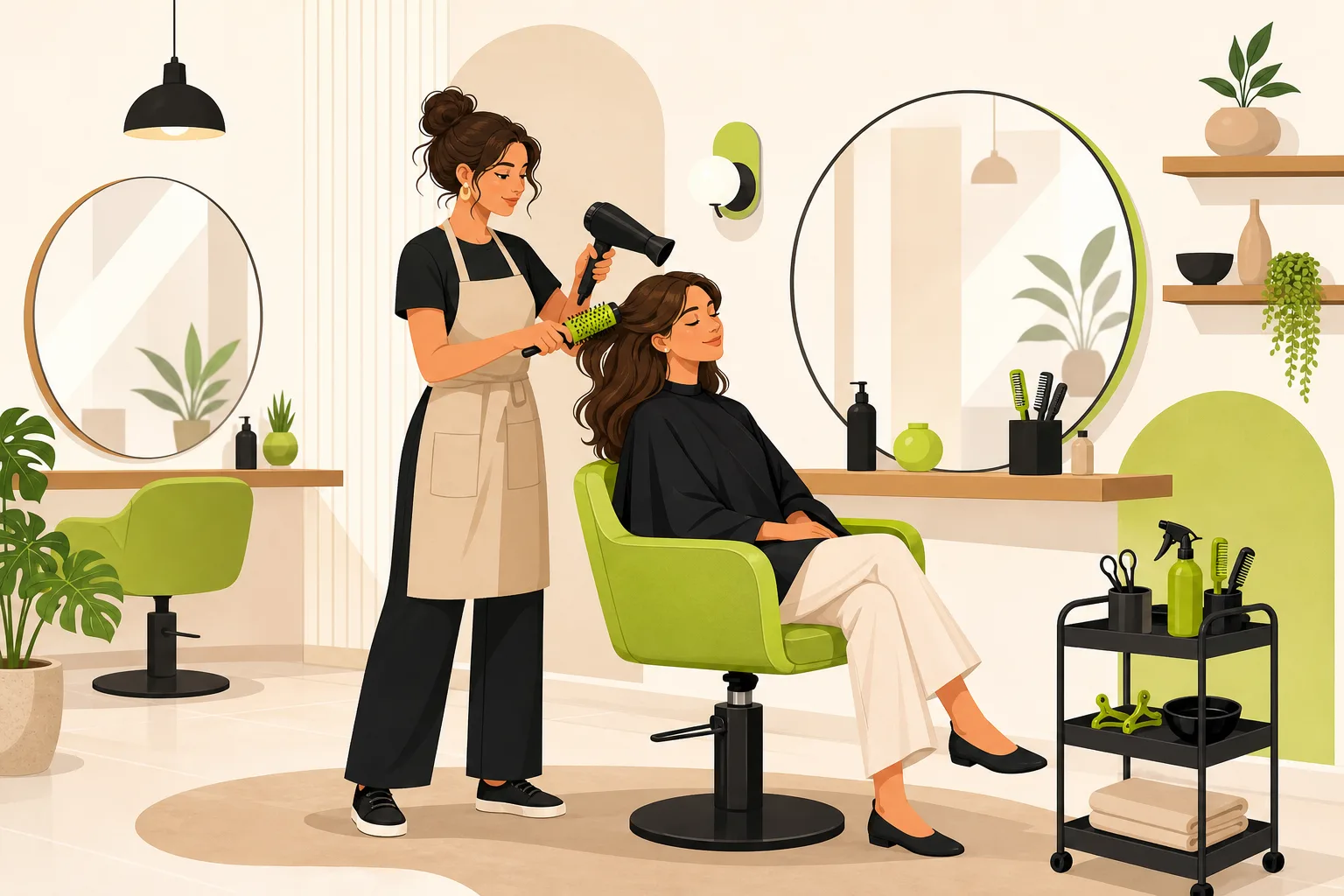
What does a hair salon website that books clients actually look like?
The anatomy is consistent across the strongest-performing sites in every market we analyzed — Austin, Denver, Phoenix, Charlotte, Nashville, Tampa. Here's what they share:
Above the fold (what loads before any scroll):
- A real photo — transformation shots, balayage close-ups, or salon interior atmosphere. Never stock.
- One primary CTA button with specific text: "Book My Appointment," "Book Online," "Schedule Now." Not "Learn More."
- A clickable phone number in the header — a lot of new clients call rather than book online.
- No star-rating badge or review count (this is the most common gap — and the most fixable).
Mid-page:
- Services section with descriptions, and pricing ranges if you're a boutique. Hiding price is a decision, not a default.
- Named stylists with real headshots and their specialties spelled out. "Which stylist should I pick?" is the friction point that kills more bookings than any other.
- Google reviews with actual names and star ratings embedded on the page — not just a link to Google.
- The booking CTA repeated 3–4 times as you scroll, not only in the hero.
The section nobody builds (and everyone should): a named-credential stack. The strongest-performing salons list exactly what they have: "Wella Certified Master Colorists, IBE-certified extension specialists, 9-month apprenticeship program." Not "experienced stylists." Specific beats generic every time.
Which pages does a salon website need to actually book clients?
The minimum viable site that consistently converts new clients has five pages:
| Page | What it must do |
|---|---|
| Home | Establish the brand, show real work, drive to booking |
| Services | Each service with a description and ideally a price range |
| Team | Named stylists, real headshots, specialties, certifications |
| Gallery | Before/after transformations, specific color work, extensions |
| Contact | Address, hours, phone (clickable), map, and a contact or inquiry form |
Service sub-pages are the biggest missed opportunity for salons with complex menus. Balayage, color correction, IBE extensions, and bridal hair each deserve their own page — that's how you rank when someone searches those terms specifically. A single "Services" page with everything listed doesn't give Google enough signal to match you with high-intent searches.
The same applies to your stylist pages. A named stylist page indexed by Google is how a client who finds their favorite stylist on Instagram then searches "[stylist name] hair salon" actually lands on your site — not on your competitor's.
What makes someone book vs. keep scrolling?
Trust resolves in the first 10 seconds or they move on. Across the best-performing salon sites in our analysis, there are five trust signals that do the most work — and a notable gap no one has closed yet:
1. Real transformation photos. Before/after images signal expertise faster than any headline. They answer "can you do what I want?" before the visitor has to ask.
2. Specific credentials over generic claims. "Vidal Sassoon trained, Wella Certified Master Colorists" says something. "Experienced stylists" says nothing. Named training programs, certification bodies, and years in business all convert better than vague authority language.
3. Reviews with names and star ratings on the homepage. Most salons link out to Google. Linking out means your visitor leaves your site. Embedding a handful of named, star-rated Google reviews directly on the homepage keeps them in your world. Only a minority of the competitive salons we analyzed do this — it's the lowest-effort highest-signal upgrade available.
4. A decision path for "which stylist?" The question behind the question on every salon booking is: who am I actually going to see? Sites that answer this directly — through a team section with headshots and specialties, or a stylist-matching quiz — convert the indecision into a lead instead of losing it. Two of the eight salons we analyzed lead with a quiz as their primary CTA instead of a raw booking button. It's the emerging differentiator in the category.
5. The open differentiator nobody has: a satisfaction guarantee. Not one of the top-ranking salon sites in our analysis offers one. A simple "if you're not happy with your color, we'll make it right at no charge" is the cheapest trust signal in local services — and it's completely unclaimed in this category.
Does a salon website need a booking button or is a contact form enough?
This depends on how you operate — but the answer matters for your conversion rate. Here's the honest breakdown:
If you use Vagaro, StyleSeat, Mindbody, or Booksy: you already have a booking system. Wire a "Book Online" button on every page that opens your existing booking flow. GrowLocal sites do not include live booking software — but your site can link directly to your booking platform on every CTA. That's the right setup.
If you don't use booking software (you prefer calls, texts, or DMs): a contact/inquiry form with a 24-hour response commitment can outperform a clunky booking flow. The key is setting expectations: "Fill in the form below and we'll confirm your appointment within 24 hours." Framed that way, it's a promise, not a dead end. Clients who weren't going to call at 11pm will fill in the form.
What definitely does not work: a single "Contact Us" page link buried in the footer with no form, just an email address. That's not a booking path, that's an obstacle course.
On mobile especially, your CTA needs to be tap-friendly and above the fold. 70%+ of salon searches happen on phones, according to research on local service queries. A site that looks good on desktop but breaks on mobile is not a salon website that books clients — it's a desktop brochure.
How does a salon website help you rank on Google?
A booking link on Instagram doesn't help you show up when someone searches "balayage near me." A website does. The mechanism is straightforward:
- Each service page (balayage, color correction, IBE extensions, keratin treatments) gives Google a specific, indexed page to serve for that search.
- Your address and neighborhood naturally appear throughout the site, which helps Google understand your location for Map Pack ranking.
- Transformation photos in a gallery, properly described with alt text, help you surface in image search for service-specific terms.
- Fast-loading, mobile-optimized pages are a direct ranking signal — especially for local results on phones.
Salons with both a strong Google Business Profile and a fast website rank for two separate surfaces: the Map Pack (showing up when someone searches "hair salon near me") and organic web results (showing up when someone searches a specific service or stylist name). Relying on only one leaves half the search surface uncovered.
The best-converting hair salon websites we've analyzed are built to capture both. See what a GrowLocal site looks like for hair salons if you want to understand what this looks like in practice.
Similar patterns hold across lash and brow studios and nail salons — the same trust-signal structure (real photo hero, named credentials, reviews, clear booking path) maps across beauty categories.
What should a hair salon website NOT do?
The mistakes that cost salons bookings are consistent across markets:
- No reviews above the fold. Testimonials buried on a "Reviews" page nobody clicks accomplish nothing. Reviews need to be on the homepage where the decision is happening.
- Stylist photos that look like ID cards. Your stylists are the product. Headshots that don't reflect the brand undercut everything else the site is trying to say.
- A single booking CTA at the top that never repeats. The visitor who scrolled past your hero didn't stop wanting to book — they just need the button to reappear.
- Copy written about the salon instead of the client. "We are a full-service salon offering cuts, color, and extensions" is about you. "Get the exact color you've been screenshotting" is about them.
- No pricing direction for new clients. If a first-time color client has no idea whether services start at $80 or $450, the uncertainty creates friction. A range or a "prices start at" note manages expectations before they call.
For more on what actually drives bookings — and what doesn't — our post on hair salon marketing ideas covers the full picture.
Getting your site right
If you're looking at your current site and counting the gaps above, the shortest path is a site built for this category from the start — not a general template retrofitted with your logo.
GrowLocal builds hair salon websites with the specific patterns that book clients: real-photo hero sections, team showcases structured for stylist selection, services sections that support pricing transparency or the consultation funnel — whichever your positioning calls for. Quote and inquiry forms with 24-hour-response framing, mobile-first layout, and fast static hosting that loads before a visitor gives up. Plans start at $20–30/month.
The gap between a site that looks like a salon and a site that books like one is smaller than most owners think. The pieces are known. The question is whether your site has them.
Browse our full industry guides to see how these same principles apply across service categories — or read more on how to make your Google Business Profile work alongside your website.
Frequently Asked Questions About Hair Salon Websites That Book Clients
Does a hair salon website need integrated booking software to get online bookings?
Not necessarily. If you use Vagaro, StyleSeat, Booksy, or a similar platform, wire a "Book Online" button on every page that links to your existing system. If you don't use booking software, a contact/inquiry form with a 24-hour response commitment converts clients who won't call — especially those browsing outside business hours. What matters is that the path from "I found your site" to "I've made contact" is short and obvious.
How many pages does a hair salon website need?
Five core pages handle most bookings: Home, Services, Team, Gallery, and Contact. Beyond that, dedicated sub-pages for individual services (balayage, color correction, extensions) and named stylist profiles significantly improve both SEO and conversion. Each service sub-page gives Google something specific to rank for that service query.
Why aren't clients booking even though they're visiting my salon website?
The most common causes: no reviews visible on the homepage (buried testimonials don't convert), a single CTA that doesn't repeat as visitors scroll, stylist photos that don't match the brand quality, and no pricing indication for new clients. Run through the list in this post — most booking gaps come down to missing trust signals, not missing traffic.
Does my hair salon website help me rank in Google Maps?
Your website supports your Google Maps ranking in several ways: it gives Google location-specific signals through your address and neighborhood references, gives credibility to your Google Business Profile listing, and service-specific pages help you rank for queries beyond "hair salon near me." A GBP profile without a website leaves the organic ranking surface uncovered.
What's the one thing most salon websites get wrong?
Burying reviews. Across GrowLocal's proprietary research into top-ranking local business websites, the majority of salon sites have testimonials somewhere — but most link out to Google or hide them on a dedicated reviews page. Embedding named, star-rated Google reviews directly on the homepage keeps the decision-making visitor on your page and gives them the social proof they're looking for right where they're looking for it. It's the single highest-leverage fix for most salon sites.
Do I need a web designer or can I use a website builder for my salon?
A general website builder (Squarespace, Wix) can produce something that looks fine, but most hair salon owners spend weeks configuring something that still doesn't have the category-specific structure that converts — proper services pages, a team showcase built for stylist selection, or fast mobile load times. A platform built for salons, or a service like GrowLocal that builds and hosts the site for you, typically produces a better booking outcome for less time investment than a DIY builder.
How often should a hair salon website be updated?
Service pages and pricing should be reviewed whenever your menu changes. The team/stylists section needs updating when staff changes. The gallery benefits from fresh transformation photos every 1–3 months — recent work signals an active, current business to Google and to visitors. The structural bones of the site (layout, CTA placement, trust signals) rarely need changing unless your positioning shifts.