


Updated June 2026
An optometrist website that wins new patients needs six structural elements: a named doctor above the fold, insurance logos on the homepage, a booking CTA in the header, real clinic photography, specialty service pages, and a visible Google rating widget. Independent practices that have all six outconvert chains and multi-location groups — not because of clinical quality, but because they remove the friction that sends patients elsewhere. This is based on GrowLocal's proprietary research into top-ranking independent optometry sites across Nashville, Raleigh, and Denver.
What does an optometrist website actually need?
Most optometry website articles give you a generic design checklist: mobile-friendly, fast, ADA-compliant. Those are table stakes. They are not why a new patient books at one independent practice over another.
Across our research into top-ranking local business websites, zero independent optometrists display an aggregate star rating with review count on the homepage — see our full local-business website data. The strongest practices showed 3–10 named text quotes, which is better than nothing. But "4.9 · 312 Google Reviews" in the hero beats every competitor who's only saying "we care about patients." That gap exists right now, and it's an easy win.
Below is the full structure — the six elements that convert, the two retail angles practices underuse, and the specialty-page strategy that captures long-tail search traffic your competitors haven't built yet.
Key takeaway: Across GrowLocal's proprietary research into top-ranking optometry sites, no independent practice displays an aggregate Google rating widget above the fold. Adding a star count + review total in the hero is an instant differentiator in every market analyzed.
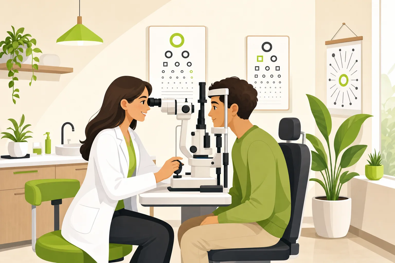
Does a named doctor belong on the optometrist homepage?
Yes — and it belongs above the fold, not buried in an "About" page.
Patients pick a person before they pick a practice. Every high-performing independent optometry site we analyzed leads with the doctor's name, credentials, and a real headshot in the hero or immediately below it. "Dr. [Name], OD" plus a one-line residency or specialization note does more trust work than any copy about "personalized care."
The practices that skip this — leading instead with the clinic name or a tagline about "quality eye care" — convert worse. Generic clinic identity is the chain's game. An independent OD's competitive edge is a real doctor who will remember patients year to year.
Three things that must be visible without scrolling:
- Doctor's full name with credentials ("OD" alone works; add board certification or residency if true)
- A real headshot — exam room or professional portrait, never stock
- A booking button ("Book Appointment" or "Request an Appointment" — consistent with what every analyzed practice uses)
Where does insurance information go on an optometrist website?
On the homepage — not on a sub-page patients have to find.
Across GrowLocal's proprietary research, insurance acceptance is the primary pre-booking filter for vision-care patients. VSP and EyeMed logos on the homepage function as a "you're in the right place" signal for a large share of visitors. Practices that put insurance information on a separate page lose patients who can't confirm coverage quickly.
The pattern that works: a small "We accept VSP, EyeMed, and most major vision plans" line plus plan logos early in the homepage — before the services section, after the hero. It takes two lines. It answers the question before the patient asks it.
A dedicated insurance page with full plan details is also valuable for SEO (patients search "VSP optometrist [city]" before they search anything else). But the homepage badge is non-negotiable.
If your practice accepts Medicaid or CHIP, that belongs on the homepage too. It signals access and reach that the chains don't always offer.
What pages does an independent optometrist website need?
The core five pages every analyzed practice has:
| Page | Why it matters |
|---|---|
| Home | Booking CTA, doctor name, insurance, reviews |
| Services hub | Eye exams / eyeglasses / contacts as the three anchors |
| About / Meet the Doctor | Credentials, story, real photo, independence angle |
| Insurance | Named plans, logos, eligibility note |
| Contact / Hours | Address, phone, hours, map embed |
But the practices that outrank competitors in local search add a second layer: specialty service pages.
Dry eye treatment, pediatric eye exams, myopia management, LASIK co-management, scleral lens fitting, NeuroLens — each of these is a real search query. A parent Googling "pediatric optometrist [city]" and a contact-lens wearer searching "scleral lens fitting near me" are high-intent patients who will book if they land on a page that speaks directly to their need.
A service hub page with a bullet list does not capture this traffic. Individual pages — one per specialty — do. Each page only needs 300–500 words, a booking CTA, and a clear explanation of who the service is for. That is how independent practices expand their search surface area without running ads.
Why does the review widget matter more than testimonials?
Named testimonials are better than nothing. But a visible aggregate count beats them for credibility.
Across our research into top-ranking optometry sites, zero practices display an aggregate Google rating widget — a star score plus total review count — on the homepage. The strongest sites show 3–10 individually attributed quotes, which is genuine and useful. But a visitor who sees "4.9 · 312 Google Reviews" in the header or hero gets instant social proof that a stack of three quotes cannot replicate.
The gap in this category is wide open. Any independent OD who adds a Google rating widget — even a simple badge — above the fold differentiates from every analyzed competitor in Nashville, Raleigh, and Denver.
GrowLocal sites include a testimonials section for hand-curated named quotes. For the aggregate widget, your web provider needs to support a live Google Reviews embed or a third-party badge (Grade.us, Birdeye, Widewail).
Two review signals worth adding, ranked by impact:
1. Aggregate star + count (homepage hero or header)
2. Named, attributed testimonial quotes (3 minimum, 8 is better)
How does the eyewear section affect conversions?
Significantly — and most practices treat it as an afterthought.
The retail half of an independent optometry practice (frames, lenses, branded eyewear) is where differentiation from chains is easiest and most visual. Chains offer the same frame brands at the same kiosks. An independent OD with a curated boutique selection, real fashion-quality photography, and designer brand names visible on the website makes a different kind of case.
Practices that treat their frame selection like retail — styled photography, named brands (Gucci, Oliver Peoples, Ray-Ban where carried), a "collections" section instead of a generic "eyewear" page — look notably better than competitors running the same template.
Across our proprietary research, stock photography in service-card thumbnails is visibly cheaper and associated with weaker site executions. The practices that look most credible photograph their actual frame wall and exam room.
Two eyewear-section signals that read boutique vs. commodity:
- Named designer brands in the copy (not just "we carry top brands")
- Styled photography — frame wall shots, close-ups on specific collections
What does the booking flow need to look like?
Short form, mobile-first, visible everywhere.
Every independent optometry site analyzed uses some version of "Book Appointment" as the primary CTA. The text variants observed: "Schedule," "Book Your Appointment," "Request an Appointment," "Make An Appointment." The specific wording matters less than placement.
Booking CTA placement that converts:
- In the header (persistent across all pages)
- In the hero section
- After every major section (services, about, eyewear)
- In the footer
The form itself: name, phone, email, insurance type, and "what brings you in" as optional context. Five fields maximum — patients on mobile abandon longer forms. A 24-hour response promise next to the form reduces drop-off.
GrowLocal sites include a contact and lead-capture form that routes appointment requests directly to you — no third-party scheduling platform required. See our optometrist website setup.
Should an optometrist website address exam anxiety?
Yes — and almost none do.
Exam anxiety is real: the puff-of-air tonometer test, eye drops, unfamiliar equipment. The practices in our analysis that acknowledged this directly — one led its hero with "no puff-of-air test" — gave themselves a concrete edge no competitor matched. A single reassurance line converts patients who've been putting off their annual exam.
Examples that work:
- "We use non-contact tonometry — no puff of air."
- "We take extra time with first-time contact wearers."
- "Kids and nervous patients are welcome — we go at your pace."
No agency-written optometry checklist covers this, because it requires actually reading what independent practices say and don't say.
Frequently Asked Questions About Optometrist Websites
What pages should an optometrist website have?
At minimum: home, services hub, about/doctor bio, insurance, and contact/hours. The practices that outrank competitors in local search add individual specialty pages — dry eye, pediatric exams, myopia management, scleral lens fitting, LASIK co-management — one per service. Each specialty page captures a distinct search query and takes only 300–500 words to build.
How do I make my optometry website different from the chains?
Three moves the chains can't replicate: name your doctor prominently with credentials and a real photo, position your practice explicitly as independently owned and doctor-run, and show a Google aggregate rating in the hero. Across GrowLocal's proprietary research, no independent optometrist sites display an aggregate star count on the homepage — so even adding that single element puts you ahead of every analyzed competitor.
Should I put pricing on my optometrist website?
Most practices don't, and that's consistent with what works. Insurance pages (VSP/EyeMed logos, Medicaid note) do the economic reassurance work instead. The one case worth making visible: if your practice offers a membership plan for uninsured patients, show the price and what it covers. Transparency is the point of the offer, and uninsured patients are a segment most competitors ignore.
How do specialty pages help an optometrist website rank?
Each specialty page targets a distinct patient search: "dry eye treatment [city]," "myopia management for kids," "scleral lens fitting near me." A service hub with bullet points cannot rank for these terms — individual pages with 300–500 words of relevant content can. The practices with the deepest service architectures in our research had the broadest local search footprint without running any paid ads.
Do I need a blog on my optometrist website?
One high-value use case: a seasonal "use your vision benefits before December 31" page, updated annually. It captures VSP/EyeMed patients searching in October–December at zero ad spend. Beyond that, a blog is optional — specialty service pages deliver better SEO return per hour for most independent ODs.
Does GrowLocal build websites for optometrists?
Yes. GrowLocal builds websites for independent optometrists — including contact/appointment-request forms, testimonial display, service pages structured for local search, and static hosting that loads fast on mobile. Plans start at $20–30/month. See all the business categories we support.
The bottom line
An independent optometrist website that converts does six things: names the doctor above the fold, shows insurance logos on the homepage, puts a booking CTA in the header and after every major section, uses real clinic photography, builds specialty service pages for each high-demand service, and adds a Google aggregate rating widget.
Across our research into top-ranking optometry sites, zero independent practices display an aggregate rating widget on the homepage. That gap is open right now in every market we analyzed. Any OD who closes it outconverts every analyzed competitor on the single most powerful social-proof signal patients look for.
Start with any missing structural element. Then add one specialty page — dry eye, pediatric exams, myopia management — for your highest-demand service. That combination drives local search traffic without paid ads.
GrowLocal builds websites for independent optometrists with appointment-request forms, service pages, testimonial sections, and fast static hosting. Plans start at $20–30/month. See all the business categories we support.
Related: SEO for optometrists: why your website structure is the strategy · What a dental practice website needs to convert new patients · What a chiropractic website needs to book new clients