


Updated June 2026
Explore the data behind this guide on our local business website statistics page.
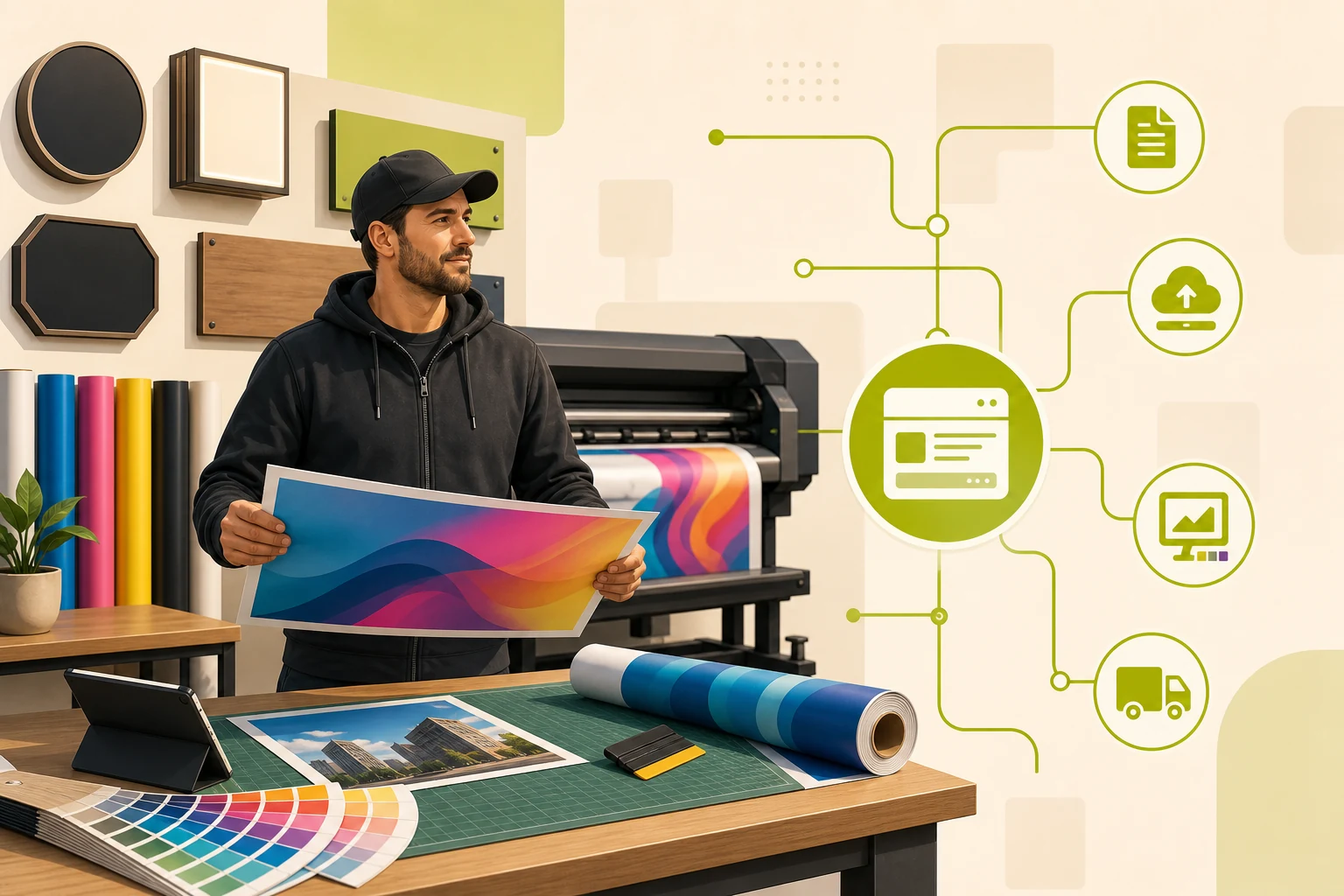
A good print shop website checklist covers nine elements: a gallery of real work, a visible quote CTA, click-to-call, your years in business, Google star rating, service pages per product type, an FAQ, mobile speed, and an honest about section. Miss any of them and the visitor you spent money to attract clicks back to search results. This is based on GrowLocal's proprietary research into top-ranking local business websites.
Most "website checklist" posts are generic — add a logo, pick a font, write an about page. That is not a print shop website checklist. What local print and sign shop buyers actually need to see before requesting a quote is specific, and the research behind this guide makes it concrete.
What does a print shop website actually need to convert local buyers?
A print shop visitor arrives with one of two problems: they need something fast, or they are researching weeks out. Both want the same answer first: can this shop handle what I need, and should I trust them?
Your site has roughly 30–60 seconds to answer both questions. The checklist below reflects what the strongest local print and sign shop sites do — and where the weakest lose visitors.
Checklist Item 1: A portfolio gallery of real work (not stock photos)
No gallery = no trust for print and sign shops. This is not a rule that applies to most trades. It is a rule that applies specifically here.
Across GrowLocal's proprietary research into top-ranking local business websites, portfolio photography of actual completed work appears on every high-performing print and sign shop site. Shops that use stock photos are immediately perceived as less credible — buyers in this category are spending $300–$6,000+ on visible branded materials, and they want proof you can execute before they call.
What makes a gallery work:
- Real photos of completed vehicle wraps, exterior signs, lobby installs, banners, wide-format prints
- Named or locationally identified work where possible ("the wall mural for a local restaurant" beats "mural project")
- Organized by product type, not just dumped into a grid
- Fast-loading — a gallery that takes 4 seconds to load loses the visitor before trust is built
A gallery is also where local SEO happens. Properly alt-tagged images with service type and city name are an on-page local signal Google reads.
Checklist Item 2: A quote CTA in the header and hero
Every print and sign shop analyzed uses a quote-request CTA as the primary above-the-fold button. Phrases like "Get a Quote," "Get Your Free Quote," and "Start Your Order" dominate. None of the strong competitors bury this action.
The mistake shops make is placing the quote form only on the contact page. By the time a hesitant visitor decides to click Contact, they're already gone. The CTA should appear:
- In the header (sticky or pinned)
- In the hero section, adjacent to your headline
- At the bottom of every service page
- Near your gallery ("Like what you see? Get a quote")
One CTA per location. Not three competing buttons — one clear next step.
Checklist Item 3: A phone number that is impossible to miss
Print and sign shop buyers are often in decision mode when they call. They want confirmation before they come in or send files. Every site analyzed shows the phone number prominently in the header — many repeat it in the hero and in the footer.
On mobile (where a significant portion of your traffic arrives), the phone number should be a tap-to-call link. Test it on your own phone right now. If tapping the number doesn't open the dialer immediately, fix it today — you are losing calls.
Checklist Item 4: Years in business, stated early
The print and sign shop category is low on visible differentiation. Buyers can't tell from the outside whether you do good work. Tenure is a credibility proxy — and across our analysis of top-ranking local business sites, every strong print and sign shop states years of experience prominently, often above the fold.
"Serving Austin businesses since 1987" is not boilerplate. To a buyer deciding between three tabs, it is evidence you haven't disappeared on a customer yet.
If you're under five years old, use an alternative trust signal: number of projects completed, certifications held, or named client work. Do not leave this space blank.
Checklist Item 5: Your Google star rating, shown on the page
This is the easiest competitive gap to close in this category.
Displaying a Google star rating with review count directly on the homepage is a high-ROI differentiator for print and sign shops — across GrowLocal's research, only one of the six top-performing local sites shows the star rating and review count on-page, despite all shops having Google reviews. Every site links to Google reviews somewhere, but almost none show "5.0 ★ (77 Reviews)" as a visible badge.
Buyers trust star ratings. A visible rating near your CTA removes the friction of "let me go check their Google listing" — and keeps the conversion on your site. See how this compares across local business categories.
Checklist Item 6: Service pages for each product type
One "Services" page listing 12 things is not enough. Individual service pages for each major product type are where local search intent lands.
A buyer searching "vehicle wrap shop Austin" is not looking for your homepage. They want a page that names the service clearly, shows photos of that specific work, states your turnaround range, and has a quote CTA.
| Service | Priority |
|---|---|
| Vehicle Wraps / Fleet Graphics | High |
| Exterior Signs (channel letters, monument, pylon) | High |
| Interior Signs (lobby, wayfinding, wall murals) | High |
| Banners & Temporary Signage | Medium |
| Window Graphics / Decals | Medium |
| Wide Format Printing | Medium |
These pages do not need to be long. Real photo, clear description, turnaround range, strong next step.
Checklist Item 7: An FAQ that saves phone calls
Buyers ask the same questions before every quote: How long does it take? Do you do design? What file format? Do you install? Rush orders?
If your site answers these, two things happen: fewer repetitive calls that interrupt production, and buyers informed enough to actually request a quote. Put your FAQ at the bottom of the homepage or on a dedicated page. Cover at minimum: turnaround time, design services availability, accepted file formats, installation, and rush capability.
Checklist Item 8: Mobile speed and tap-to-call
More than half of local business searches happen on mobile. A site that loads slowly or makes it hard to call from a small screen fails the majority of your traffic.
Mobile checklist: page loads under 3 seconds on 4G, phone number is tap-to-call (not just text), quote form fields are large enough to tap, gallery images are compressed without quality loss, and navigation collapses cleanly. One shop site noted in the research adds a "File Upload" shortcut in nav for repeat clients arriving with print-ready files — a small detail that earns loyalty.
Key takeaway: Across GrowLocal's research into top-ranking local business websites, portfolio photography of real completed work appears on every high-performing print and sign shop site — and displaying a Google star rating on-page is an easy gap almost no competitor has closed. Fix both and you outperform most local search results without a single ad dollar.
Checklist Item 9: An honest about section with real trust signals
"About Us" is not a formality. In the print and sign shop category, it is the page where buyers decide whether you are a real business or a fly-by-night operation.
What a strong about section includes:
- Years in business (or founding story)
- Who owns and runs the shop (names + faces build local trust)
- Certifications: 3M MCS Warranty is the strongest product-backed guarantee in this category — if you have it, show it with the logo. ISA membership, UL certification, and veteran/woman-owned designations are differentiators worth displaying.
- The local area you serve
- A secondary CTA ("Ready to work together? Get a quote")
Named certifications with visible logos outperform text claims. A buyer who sees the 3M MCS Warranty badge knows that guarantee is backed by a manufacturer — it is not just your verbal promise.
How GrowLocal builds print shop websites
GrowLocal builds custom websites for print and sign shops with every item on this checklist planned from the start: gallery sections built for real project photography, quote CTAs above the fold, service pages per product type, FAQ, click-to-call, trust signals, and mobile-first design. You preview the full site before paying and request revisions until it's right.
For comparison, see our overview of websites for local service businesses across all 90+ categories we serve.
Frequently Asked Questions About Print Shop Websites
What pages does a print shop website need?
At minimum: a homepage, a gallery/portfolio page, individual service pages for each major product type (vehicle wraps, exterior signs, banners, etc.), an about page, and a contact/quote page. Shops with strong local search rankings typically add an FAQ section and a blog with trade-relevant content.
Does a print shop website need a gallery?
Yes — the gallery is the single most critical trust signal in this category. Buyers are spending hundreds to thousands on visible branded materials and want proof of work before they call. A site without real completed-project photos will consistently lose to competitors who have one. See our print and sign shop website page for how gallery sections are structured.
Should a print shop publish pricing on its website?
No. Every strong print and sign shop site is quote-only — no price ranges, no "starting at" language, no tier tables. Pricing depends on material, size, quantity, installation complexity, and turnaround. Buyers in this category expect a quote conversation, not an e-commerce cart.
What certifications should a print shop show on its website?
The strongest product-backed guarantee is the 3M MCS Warranty — a manufacturer certification signaling material quality and installation standards above a shop's own verbal promise. ISA membership, UL certification for electrical signs, and veteran or woman-owned designations are also strong trust differentiators worth displaying with logos.
How important is mobile for a print shop website?
Very. Over half of local searches happen on mobile. If your phone number isn't tap-to-call, your quote form is hard to fill on a small screen, or your site loads slowly on 4G, you are losing the most active portion of your searcher traffic. Test your own site on your phone before assuming it works.
Do print shops need separate service pages?
Yes — individual service pages are where high-intent local search traffic lands. A single "Services" page listing 12 products cannot rank for "vehicle wrap shop [city]." Each major service deserves its own page with photos, a description, turnaround info, and a quote CTA.