


What Patients Need From Your Urgent Care Website (And What Most Clinics Miss)
Updated June 2026
An urgent care website needs to answer four questions in under 20 seconds: Are you open right now? Do you take my insurance? What will it cost? And where exactly are you? Most urgent care websites fail at least two of these. Across GrowLocal's proprietary local-business website research, the gap between clinic sites that convert walk-in patients and the ones that lose them traces back to the same handful of missing or buried elements — not design, not branding, but operational information patients need before they leave the house.
This is based on GrowLocal's proprietary research into top-ranking urgent care websites.
What does a patient actually check before driving to urgent care?
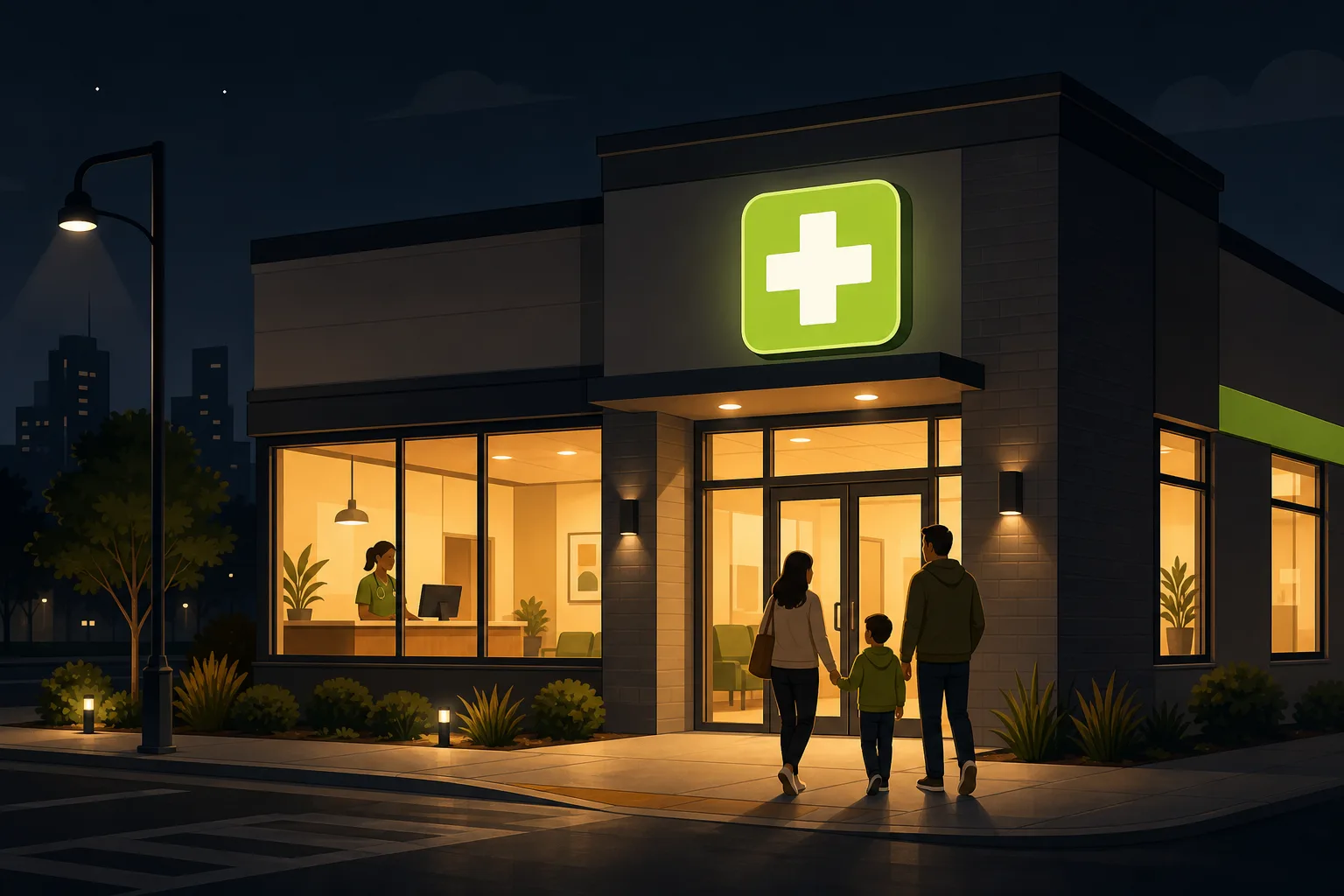
Picture someone whose kid just spiked a 103-degree fever at 9 PM on a Tuesday. They grabbed their phone, typed "urgent care open now near me," and landed on your site. They have about 20 seconds. They are not reading your About page. They are not watching your homepage video. They are scanning for one thing: confirmation that coming to your clinic is the right decision right now.
That scan covers:
| What patients check | Why it matters |
|---|---|
| Hours (are you open now?) | Drives or doesn't drive — this is the binary decision |
| Insurance (do you take mine?) | Most patients won't risk the co-pay uncertainty |
| Self-pay cost (if uninsured) | A meaningful share of urgent care patients are uninsured |
| Address + directions | They need the fastest route, not just the neighborhood |
| Services (do you treat this?) | "Do you see kids?" or "do you do stitches?" — specific, not general |
| Walk-ins accepted | Online scheduling cannot imply "appointment required" |
If your website makes any of these hard to find, the patient moves to the next search result. Not because they chose a better clinic — because they chose a faster answer.
What do patients need to see above the fold?
Everything that triggers the "yes, I'm going there" decision should be visible without scrolling — on a phone screen.
Hours, today's specifically. Not just a weekly table. If it's Tuesday at 9 PM and you close at 10 PM, that needs to be visible. If your hours are seasonal or holiday-adjusted and the site isn't current, you're sending people to a locked door.
Your phone number, clickable. In the header or the hero, every time. Patients deciding between you and the ER may want to call before they drive. Make it a single tap.
"Walk-ins welcome" next to your booking CTA. This is more important than it sounds. Offering online check-in is a good thing. But the moment a patient reads "Schedule Your Visit" and doesn't see a walk-in option, they wonder if appointment-less patients get lower priority. Say it explicitly, every time you mention scheduling: walk-ins welcome, no appointment needed.
One primary CTA. Across our analysis of independent urgent care sites, the highest-converting call-to-action phrase is not "Book an Appointment" — it's "Save My Spot" or "Reserve My Spot." The framing signals convenience, not obligation.
What insurance information do patients actually need?
"We accept most major insurance plans" is the most unhelpful line on most urgent care websites. Patients don't want "most major." They want to know if their specific plan is accepted before they leave the house. Three things that actually help:
- Insurance logo row. BCBS, Aetna, Cigna, UHC, Humana, Medicare — display the actual logos of every plan you accept. Logos register faster than text and function as instant qualification for the patient who sees their plan in the grid.
- A self-pay rate, in dollars. A meaningful share of urgent care patients are uninsured or underinsured. They are searching "how much does urgent care cost without insurance" alongside searching for your clinic. The sites that publish a flat self-pay rate — even a simple "$140 urgent visit" — capture that searcher. The sites that hide pricing lose them to whoever publishes a number first.
- Membership pricing if you offer it. If your clinic has a monthly membership plan for self-pay patients, that's a competitive differentiator worth showing on the homepage, not the pricing page.
Key takeaway: Across GrowLocal's proprietary local-business website research, pricing transparency is one of the sharpest differentiators among clinics competing for uninsured patients — and most urgent care sites hide it entirely. See our pricing-transparency data.
How should you handle wait times on your website?
This is the biggest gap in urgent care web presence, and the most actionable one.
None of the independent urgent care sites we analyzed in our research showed a live queue or wait time on their homepage. Not one — across our analysis of six independent clinics in Austin, Charlotte, and Nashville. One clinic came closest: a written guarantee that patients would be seen within 10–20 minutes of arriving. That guarantee, posted prominently, was the most powerful single trust signal in the entire set.
If your clinic consistently sees patients quickly, you can publish that as a promise: "Patients are typically seen within 20 minutes of arrival." That sentence, in small type near your CTA, does more to convert a patient weighing you against the ER than almost anything else on the page. No competitor in most markets is saying it.
What does the services section need to include?
Patients often search for the specific condition, not the category: "does urgent care treat UTI," "urgent care for stitches," "urgent care near me that sees kids." Your services list needs to be explicit enough to capture that intent.
A strong services display covers: common illnesses (flu, fever, infections), injuries (sprains, cuts, fractures), on-site lab + X-ray (call this out — it matters), physicals, and occupational health if you offer it. Always state your pediatric age minimum explicitly: "We see patients 6 months and older." Parents of young children specifically search for this.
Use a card grid — 6 to 12 cards with icons are faster to scan than a bulleted list, and they signal an organized, capable clinic.
What trust signals actually work for urgent care websites?
Agency guides list "testimonials" and "professional photography" as if they're equivalent. They're not. For urgent care, these specific signals carry weight:
Physician-owned, in the hero — not the About page. "Locally owned by ER physicians" is a headline, not a footnote. The chains competing for your patients — the CVS MinuteClinics, the CareNow and AFC franchises — cannot say this. It is the one competitive position they cannot copy. Every independent clinic in the category that leads with this in the hero does it better than the ones that bury it. Put it where it counts.
A Google review count and star rating. Here is a genuine gap in this category: across our analysis of independent urgent care websites, not one displayed a Google star rating or review count on the homepage. A "4.8 stars from 900+ Google reviews" badge in the hero trust block would beat every competitor we analyzed. This is a five-minute change that nobody has bothered to make.
Real clinic photography. An exterior photo of your actual building proves the place exists and gives patients something to look for when they arrive. Provider headshots with credentials build the physician-owned story visually. Stock photos of stethoscopes do neither, and your competitors are all using the same stock library. Real photos of your clinic are an immediate differentiator.
Named patient testimonials with quotes. Not star ratings (though those belong on Google), but quoted patient words on the page — even four or five. "Fast, professional, and they actually explained everything" from a real patient name does more than a generic "5 stars."
What do most urgent care websites get wrong?
The same mistakes appear consistently:
- Hours buried below the fold or on the Contact page. The single most damaging UX failure for urgent care — the best sites show hours in the hero, the worst put them on a separate page.
- "We accept most major insurers" without logos. Vague language creates doubt; carrier logos create instant qualification.
- Self-pay pricing hidden or absent. Uninsured patients bounce to the next site that gives a number.
- Online booking that reads as required. "Schedule an Appointment" without "Walk-Ins Welcome" beside it signals walk-in patients are second-class.
- Physician-ownership buried in About. Chains cannot say "locally owned by ER physicians." Lead with it.
- No pediatric minimum stated. If you see patients 6 months and older, say so — parents specifically search for this.
- No wait-time signal. Even a written promise ("typically seen within 20 minutes") is better than silence.
Common Questions About Urgent Care Websites
What's the most important thing to show on an urgent care website?
Current hours, visible without scrolling on mobile. Everything else matters — insurance, pricing, services — but if a patient can't immediately confirm you're open right now, they're gone before they see any of it.
Should urgent care websites show prices?
Yes, especially self-pay rates. A meaningful portion of urgent care patients are uninsured or underinsured and are comparing costs before they decide where to go. Publishing a flat rate like "$140 urgent visit" captures that searcher. Across GrowLocal's proprietary research into local-business websites, pricing transparency is one of the clearest differentiators between sites that convert and sites that don't — see our full pricing-transparency data.
Do patients prefer online booking or walk-in for urgent care?
Both — and the key is making clear that walk-ins are welcome without making booking feel required. The highest-performing urgent care CTAs pair an online check-in option ("Save My Spot") with an explicit "Walk-Ins Welcome" message. Neither alone is as strong as both together.
How should urgent care websites handle insurance information?
With actual carrier logos, not vague language. Display the logos of every plan you accept — BCBS, Aetna, Cigna, UHC, Humana, Medicare. Then add one clear line for self-pay patients. The combination qualifies insured patients instantly and captures uninsured ones rather than losing them to silence.
What's the biggest missed opportunity on independent urgent care websites?
Not leading with physician ownership. The chains — CareNow, AFC, MinuteClinic — cannot say "locally owned by ER physicians." Independent clinic owners who bury this in their About page are giving up the one differentiator their competition literally cannot copy. Put it in the hero headline, not a subpage.
What internal pages does an urgent care website need?
At minimum: home, services (or "What We Treat"), locations with hours per clinic, insurance and self-pay pricing, about/physician story, and contact. Sub-pages for occupational health and physicals are worth adding if you offer them — they capture B2B employer clients and specific search queries that a homepage alone won't rank for.
What GrowLocal Builds for Urgent Care Clinics
A GrowLocal site for an urgent care clinic includes everything patients need: hours and location above the fold, insurance logos, self-pay pricing, a services card grid, a physician-story section, patient testimonials, and a contact form — built as a fast static site that loads in under a second on mobile. You preview it before you pay anything.
See what we build: urgent care website examples at GrowLocal.
Thinking about marketing beyond the website? Read our guide to urgent care marketing strategy for independent clinics. For other healthcare categories, explore all healthcare website options at GrowLocal.