

Most coffee shop owners know their website isn't doing much. What they don't always see is exactly what it's failing to do — and for cafes, the stakes are higher than for most local businesses because the visit is impulsive. Someone searches "coffee near me" at 8am while commuting. They tap your listing, land on your site, and they're gone in ten seconds if they can't find your hours. After analyzing independent cafes and coffee roasters from all over the country — studying their hero copy, page structures, photography, and trust signals in detail — the patterns are consistent. The gap between a website that wins the "coffee near me" moment and one that loses it comes down to a handful of specific, fixable decisions.
What we found analyzing real cafe websites
Hours and address are the most searched information — and almost nobody puts them above the fold. In our analysis of coffee shop websites across multiple US markets, only one site — a Denver cafe — actually leads with hours. Every other site requires at least one click to find them, and most bury them in the footer. The irony is that coffee visits are almost entirely impulse-driven: someone is deciding whether to stop in right now. Your website's one job in that moment is to tell them if you're open and where you are. Most competitor sites fail this test entirely, and it's a straight-line win for any cafe that fixes it.
The strongest hero headlines bake in a concrete differentiator. The hero copy we saw ranged from weak mood phrases to copy that immediately communicates something specific and real. An Austin cafe we analyzed leads its hero with the fact that it operates 24 hours a day, seven days a week — the headline is the differentiator. A Tampa roaster opens with "8 Locations Across Tampa / SINCE 2012 / SMALL BATCH" in a badge strip directly under the hero. A Phoenix shop built around a 1950s drive-thru service station leads with "THE VALLEY'S ORIGINAL COFFEE CARHOP" — the building is the brand story, stated in five words.
Compare those to the weakest headline we analyzed: "Where the World Meets." It's pure mood with no information — and the site underneath it had zero trust signals of any kind.
Trust-signal strips work, and almost no one uses them. The standout layout move across every site we analyzed belonged to one Tampa roaster. Below the hero, a horizontal badge band carries: location count, founding year, a value proposition ("SMALL BATCH"), and a promotional hook ("FREE SHIPPING OVER $25" / "SUBSCRIBE & SAVE 10%"). This is the cheapest credibility-per-pixel we saw in any category. Every piece of information in that strip would fit in a tweet — but grouped together, they answer every credibility question a first-time visitor has in under three seconds.
Most of the sites we reviewed had nothing like it. If your site is missing this, the fix is a single row of five elements. It's worth doing.
Named testimonials with photos are rare and extremely effective. One Tampa cafe features three testimonials with customer headshots and full names. One Nashville roaster shows five homepage testimonials. One Phoenix drive-thru uses three named reviewers — "Kelsey R", "Jessica S", "Laurel P" — with short, specific quotes: "Consistently good coffee." Not a star widget. Not "hundreds of happy customers." Actual names, actual words.
Across our proprietary local-business website research, the majority of local competitors across every category lack a specific review count or real-name testimonial above the fold — making it an instant differentiator in almost any local market. The cafe category is no exception. Every site we analyzed has no Google or Yelp star count embedded on the homepage. Not one. This is a free win.
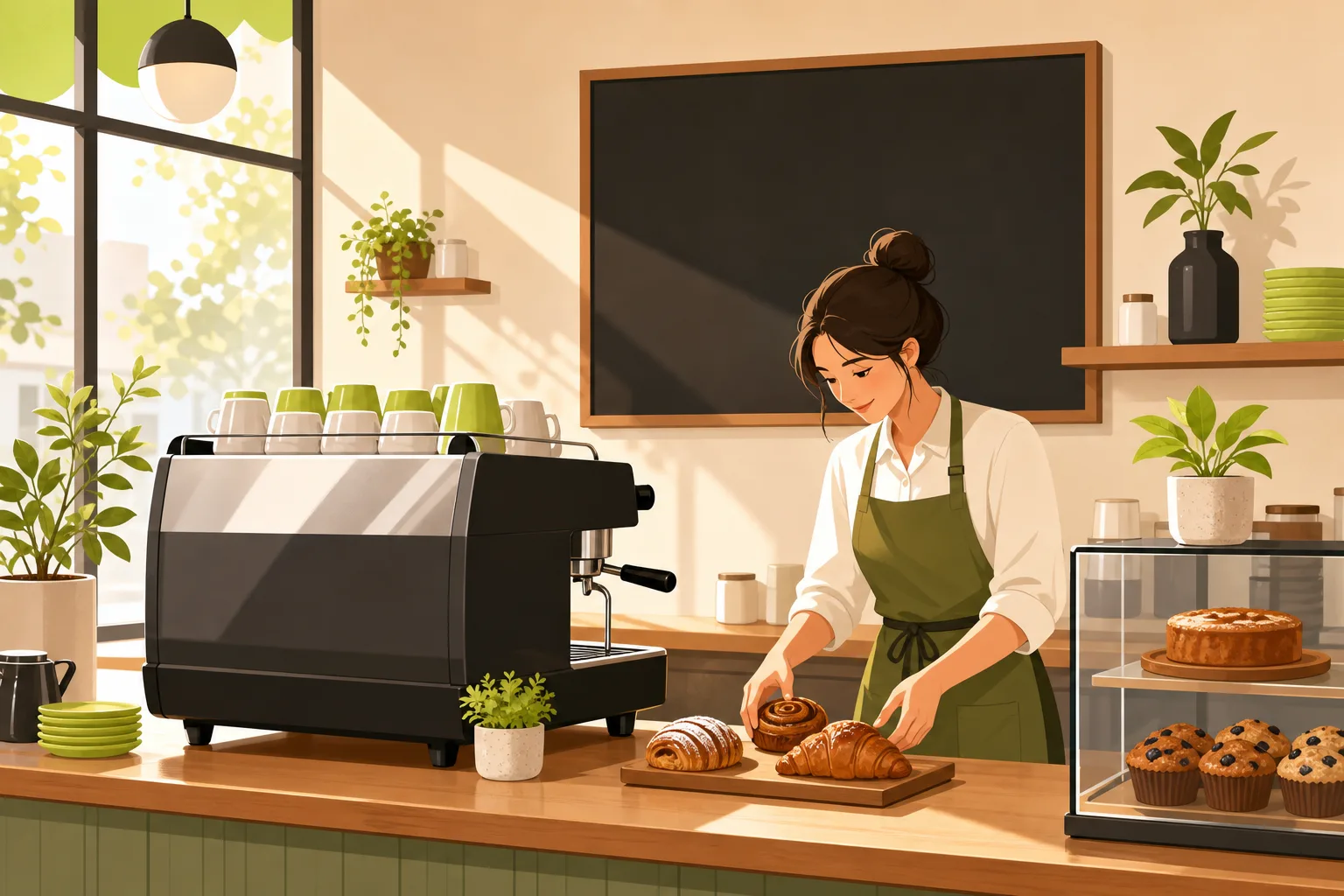
Real photography is non-negotiable — and the category has zero tolerance for shortcuts. Across our proprietary local-business website research, zero stock photography was detected on top-ranking cafe and food category competitors. This isn't a preference; it's a category rule. The visual subjects that recur across the strongest sites: latte art close-ups, pastry detail shots, interior ambiance with natural light, barista portraits, branded packaging. One Phoenix shop built a significant portion of its identity around exterior photography of its converted 1950s gas station building — the space itself is the differentiator, and the photos prove it. Stock kills trust in this category instantly. If your current site uses stock photos of coffee cups, that's the fix to start with.
What your site actually needs (table stakes vs. differentiators)
Non-negotiable — every competitor has this:
- Hours and address visible on the homepage, ideally above the fold
- Real photography: drinks, interior, pastries, your actual space
- An about/origin story — every single one of the eight sites we analyzed has one; it's the category's foundational trust asset
- Menu access within one click of the homepage
- Dark neutral background + warm metallic accent palette (the visual language of the entire category — every one of the eight sites uses some variation of charcoal/espresso/near-black + gold/copper/orange/amber + cream or white)
- 4–6 nav items maximum; one site we analyzed uses exactly five: HOME | MENU | STORY | LOCATIONS | CONTACT — clean and easy to copy
Differentiators — what the best sites have that most don't:
- Hours and address above the fold (not just on the homepage — above the fold)
- A hero headline with a concrete differentiator: hours, location count, heritage, a signature item — not a mood phrase
- A trust-signal strip under the hero: founding year, location count, one offer
- Named testimonials with photos, not star graphics
- A name for your signature item. The best cafes we analyzed give their drinks actual names: "The Raven" mocha, a signature espresso drink with a heritage-tied name. Named items give your regulars something to talk about, give your copy something to anchor, and give local press something to mention. Generic menu labels don't do any of that.
- Real Google or Yelp review count embedded on the homepage. Not one competitor in our research set does this. If you have 200 Google reviews at 4.8 stars, showing that number on your homepage is a free, instant trust signal no competitor is using.
We see the same trust-signal logic in adjacent food categories — the same principle (specifics outperform vague claims) holds when we build sites for bakeries and bars and breweries. You can also see how these patterns apply across the full range of local business websites we've built.
The coffee-shop-specific mistakes we see most
A PDF menu. In our research of food and beverage categories, PDF menus are a well-documented conversion killer — and they're still common. On mobile, a PDF means pinch-to-zoom, landscape rotation, and a page that Google can't crawl. An HTML menu page — even a simple one — is indexed by Google, readable on any phone without gestures, and can carry your SEO terms ("espresso drinks," "cold brew," "pour-over Austin") as actual text. Your competitors who still use PDFs are handing you a direct SEO advantage.
The CTA mismatch. The right primary call-to-action for a cafe depends on your model — and getting it wrong sends people to the wrong place. Cafe-first (sit down, stay awhile): your primary CTA is "View Menu" and "Get Directions," paired. If you have actual online ordering: "Order Online" is correct as the single primary verb. If you don't have ordering but use "Order Online" as a button that goes to a third-party aggregator, you're starting that relationship with confusion. Pick the one verb that matches what you actually offer.
One Austin cafe we analyzed has "VIEW MENU" + "EXPLORE OUR MENU" both linked — two CTAs doing the same job. Pick one and give the other slot to directions or hours.
Nav bloat. One Charlotte roaster we analyzed has 17+ navigation sub-items. It reads like a sitemap, not a welcome. The clean pattern across the category is 4–6 top-level items. If you have a wholesale program, classes, subscriptions, and a shop, those can all exist — but they go inside clean top-level sections, not each as their own nav item.
Generic hero copy when you have a real story. Every one of the eight sites we analyzed has a founder story. Some put it front and center in the hero ("PEOPLE FIRST. COFFEE ALWAYS." from a cafe founded by two former teachers is a hero headline that carries the origin story in four words). Others bury a compelling story in an About page nobody reads. If your cafe has a real origin — repurposed building, charitable mission, in-house roastery, unusual hours, unusual model — that story belongs in the hero, not three pages deep.
The phone question
Whether your phone number needs to be prominent depends on your service model. Drive-thru and counter-service cafes should make the phone visible everywhere — one Phoenix drive-thru we analyzed shows the phone number four times on a single page. Destination and specialty cafes can afford to keep it in the footer. If someone is choosing your specialty espresso bar over the one three blocks away, they're not calling ahead; they're showing up or ordering. But if someone is trying to find out if you still have parking, or whether you do corporate catering, or whether you're open on Sundays — and your phone is invisible — you've lost that inquiry.
What to build first
If you're starting from scratch or rebuilding an outdated site, the order that matters:
- Get real photography before anything else. Interior, drinks, pastries, the space. The photography is the site for a cafe; everything else is chrome.
- Put hours and address above the fold on the homepage. Not near the footer. Above the fold.
- Write a hero headline with a concrete fact: your hours, your founding year, your location count, your roasting operation, your signature item. Not a mood phrase.
- Build the trust strip. Founding year + location count or something similarly specific + one offer. Five elements, one horizontal row.
- Pick your primary CTA and use it once, clearly. "View Menu" for cafe-first; "Order Online" only if ordering actually exists.
- Name your signature drink or item. One name. Give it to the drink your regulars already order by description. Put it in the hero or just below it.
- Keep the nav to 5 items. If you have a shop, subscriptions, and a wholesale program — great, they all exist — but they live inside a clean top-level structure, not each as their own nav entry.
If you run an independent cafe or coffee shop and your website is losing people in the "coffee near me" moment, the fixes are mostly structural — not cosmetic. GrowLocal builds cafe websites designed around how coffee shop visitors actually behave: impulsive, mobile, needing hours and a menu in under three seconds. We handle design, build, and hosting starting at $20–30/month, and you preview the site before paying anything. See the full range of local business websites we build, or go straight to cafe websites to see what we put together for coffee shops.