

Updated June 2026
A dentist website wins new patients when it puts trust on the first screen: a real review count, the named doctor with credentials, a dollar-anchored new-patient offer, and a one-tap way to call or request an appointment. The practices that lead with a number — reviews or price — convert far better than the ones that open with "Welcome to our practice." Anxiety and cost are the two objections to answer first.
This is based on GrowLocal's proprietary research into top-ranking local business websites, including the dentist category specifically. Below: the homepage layout that converts, the trust signals patients actually scan, how to handle pricing, and the honest answer on online booking.
What does a dentist website need to book new patients?
A new patient deciding on a family dentist scans for four things before they call: how many reviews you have, who the dentist is, what a first visit costs, and how fast they can reach you. Your homepage has to answer all four above the fold.
The strongest dentist sites we analyzed do this with a number in the hero — a quantified review count like "650+ five-star reviews" or a dollar-anchored special — never a philosophy paragraph. A common failure pattern is burning the highest-converting space on the page on the practice name or a wellness lecture.
Here is what the homepage needs, in priority order:
| Element | Why it converts |
|---|---|
| Quantified review count + rating | Proof a stranger trusts you; a real number beats "trusted name in dentistry" |
| Named doctor + DDS/DMD + school | The doctor is the product; credentials are the trust core |
| New-patient offer with a dollar figure | Removes cost fear for uninsured shoppers |
| Click-to-call + appointment-request form | Two ways to act, both above the fold |
| Anxiety-relief language | Answers the category's hidden objection |
Key takeaway: Across our research into top-ranking local business websites, 92% of local business sites hide pricing entirely (N=237 sites, 28 categories). Dentistry is one of the rare trades where showing a single anchor price — a new-patient special — is a proven differentiator, not a risk.
What trust signals do dental patients look for first?
Patients trust a number or a name, not an adjective. The dentist sites that win quantify everything: the review count, the years in practice, the doctor's school and residency. The ones that lag just say "trusted" and "experienced."
This matters because dental patients research heavily before booking. According to the BrightLocal Local Consumer Review Survey (2024), 81% of consumers used Google to read reviews for local businesses — so by the time someone lands on your site, they have already seen your star rating and are looking for confirmation. Your homepage either reinforces that or undercuts it.
Lead with these, in this order:
- A specific review count — "4.9 stars, 175+ Google reviews" beats any vague trust claim.
- The named doctor — full name, DDS or DMD, dental school, residency. A real headshot, not a stock smile.
- Years in practice — "serving families since 1985" is a one-line trust anchor.
- Specific certifications — "Invisalign Sapphire Provider" out-converts a generic "certified dentist" badge.
- Named insurance carriers — listing Delta Dental, Aetna, and Cigna beats "most insurance accepted."
The word "trusted" is the single most common — and least differentiated — adjective in local business hero copy across our research. If your hero could belong to any of nine competitors, it is not working. See our full dentist website breakdown for the trust-signal layout that stands out.
How should a dentist website handle pricing?
Show one price and route the rest to an Insurance & Financing page. The winning pattern across the dentist sites we studied is a single dollar-anchored new-patient special up front — and everything else (cleanings, crowns, implants) sent to a financing page with named carrier logos and a membership-plan option for the uninsured.
This is unusual. Across GrowLocal's proprietary local-business website research, the default is total opacity — most sites funnel every visitor to a quote form before naming a figure. Dentistry breaks the rule profitably: an anchor price like a "$99 new patient exam" gives the price-sensitive, uninsured shopper a reason to call instead of bouncing to the next practice.
In-office membership and savings plans are an emerging differentiator for exactly this segment. They turn an uninsured one-time visitor into recurring revenue without requiring insurance — and only a minority of practices offer them, so they still stand out.
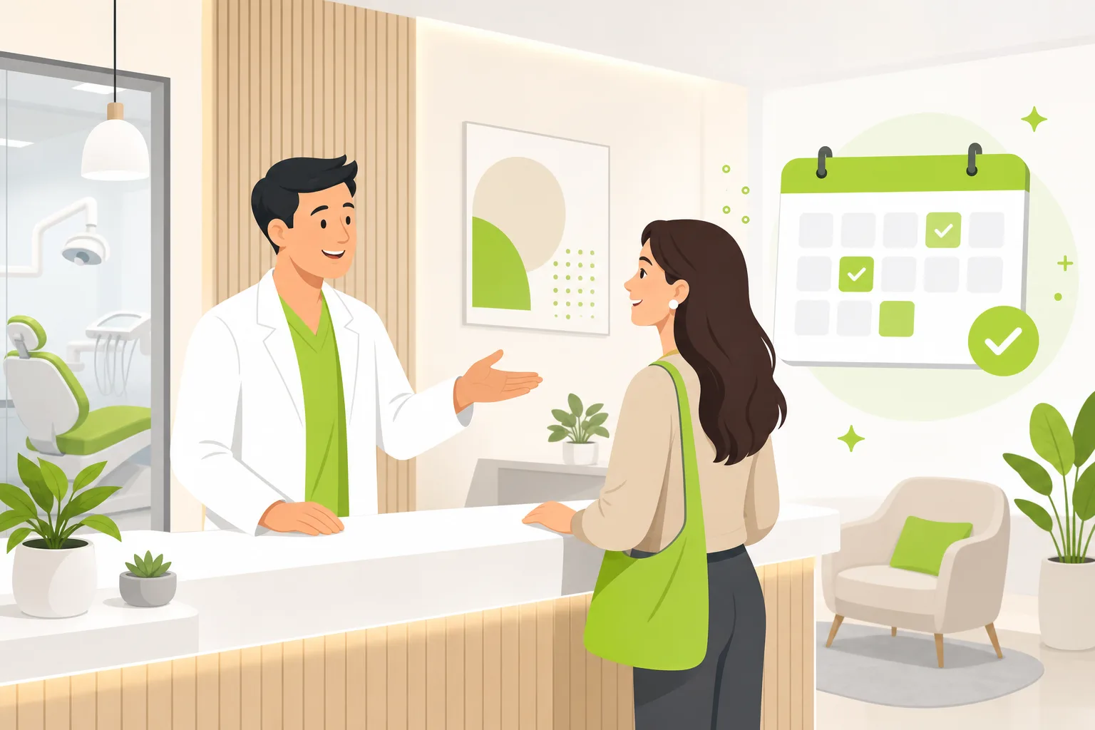
Do dentists need online booking on their website?
Real-time online booking is the rising patient expectation, and it is honest to say most practices do not have it yet — which makes a fast, frictionless appointment request the practical win today. A GrowLocal dentist site does not include a live booking calendar. What it does include is a short appointment-request form (keep it to four to six fields) paired with a 24-hour-response promise and click-to-call.
That combination captures the same intent. Phone is co-primary with the booking button on every dentist site we analyzed — never a secondary action — and the most aggressive practices repeat the number five or more times down the page. "Call or Text" outperforms "Call" where it appears.
A GrowLocal dentist site ships with the trust and conversion pieces that move patients: a quote and appointment-request form, manually-entered patient testimonials, a service page for each treatment, a gallery section for before-and-after smiles, an FAQ block to answer the anxiety questions, and fast static hosting so the page loads before an anxious patient changes their mind. The same form-plus-fast-response pattern wins in adjacent health categories — we see it on chiropractor websites and optometrist websites too.
What pages should a dentist website include?
Keep it lean: home, a services hub with a page per treatment, about/meet-the-doctor, a new-patients page, insurance and financing, and contact. A focused sixteen-page site beats a content wall that buries the call-to-action under a dozen sections.
Give emergency dentistry its own nav item and page — it captures the urgent-intent searcher every market has, the patient typing "emergency dentist near me" at 9 p.m. The same urgent-versus-planned split shows up across local health and home services; our website essentials checklist covers the pages every local business needs, and the dental practice conversion guide goes deeper on the booking flow.
The treatment pages that earn their place: general and preventive, emergency, children's dentistry, implants, Invisalign or clear aligners, and cosmetic. Each gets a real page, not a buried list item — that is how patients find you for specific searches. Browse more trades on the GrowLocal industry website hub.
Common Questions About Dentist Websites
How much does a dentist website cost?
A done-for-you dentist site runs far less than the agency quotes most practices fear, and GrowLocal pricing matches what is shown on our pricing page. The bigger cost is a slow or generic site that loses the uninsured shopper to a competitor showing a $99 special. Pricing structure for a dental practice should anchor one new-patient offer and route the rest to financing.
Can I just use my Google Business Profile instead of a website?
No. Your Google Business Profile gets you found, but it cannot host service pages, before-and-after galleries, your insurance list, or an appointment-request form. Since 81% of consumers used Google to read reviews in 2024 (BrightLocal), patients arrive having already seen your profile — the website is where they decide.
What should be in a dentist website hero section?
A quantified review count or a dollar-anchored new-patient special, the named doctor, click-to-call, and an appointment-request button — all above the fold. Never open with "Welcome to our practice" or a philosophy paragraph; that wastes the highest-converting space on the page.
Do I need online booking or is a request form enough?
A fast appointment-request form with a 24-hour-response promise wins new patients today. Live online booking is the rising expectation, but a four-to-six-field form paired with prominent click-to-call captures the same intent without the patient leaving your site.
How do I get dental patients to choose me over a similar practice?
Put a number where competitors put an adjective. Most dentist sites say "trusted" and stop; the ones that win quantify reviews, name the doctor's credentials, and show one anchor price. See the dentist website breakdown for the exact layout.
Do I need a web designer or can I use a website builder?
You can use a builder, but a dental practice has specific conversion needs — anchor pricing, insurance lists, anxiety-relief copy, emergency pages — that generic templates miss. A done-for-you site built around dental buyer behavior gets those right from day one without the DIY learning curve.