


Most independent restaurant owners know their website is behind. What they don't know is exactly what's costing them tables. After analyzing independent restaurant websites from all over the country — tracking everything from hero headlines to sitemap depth to how prices are displayed — a clear picture emerges. The gap between a website that fills seats and one that just exists isn't design budget. It's a handful of specific decisions, most of them free to get right.
Explore the data behind this guide on our local business website statistics page.
The menu PDF problem (and why it matters more than you think)
In our analysis of restaurant websites across the US, PDF menus were still the norm. One well-reviewed Charlotte restaurant links directly to PDFs from their navigation. On mobile — where 70% or more of restaurant traffic arrives — a PDF menu means zoom-and-scroll, pinching to read prices, and frustrated users who bounce before deciding.
HTML menu pages beat PDFs on every dimension that matters: mobile readability, load speed, and SEO (Google can index your actual dishes and prices; it cannot crawl a PDF effectively). Most of your local competitors are still on PDFs. Building an HTML menu is one of the fastest ways to differentiate your site from the three other spots someone is comparing you to at 6:30pm on a Friday.
What your homepage actually needs to answer in three seconds
Restaurant visitors aren't doing research. They're deciding right now. The question in their head: "Is this the place for tonight?" Your homepage has about three seconds to answer four questions before they hit the back button:
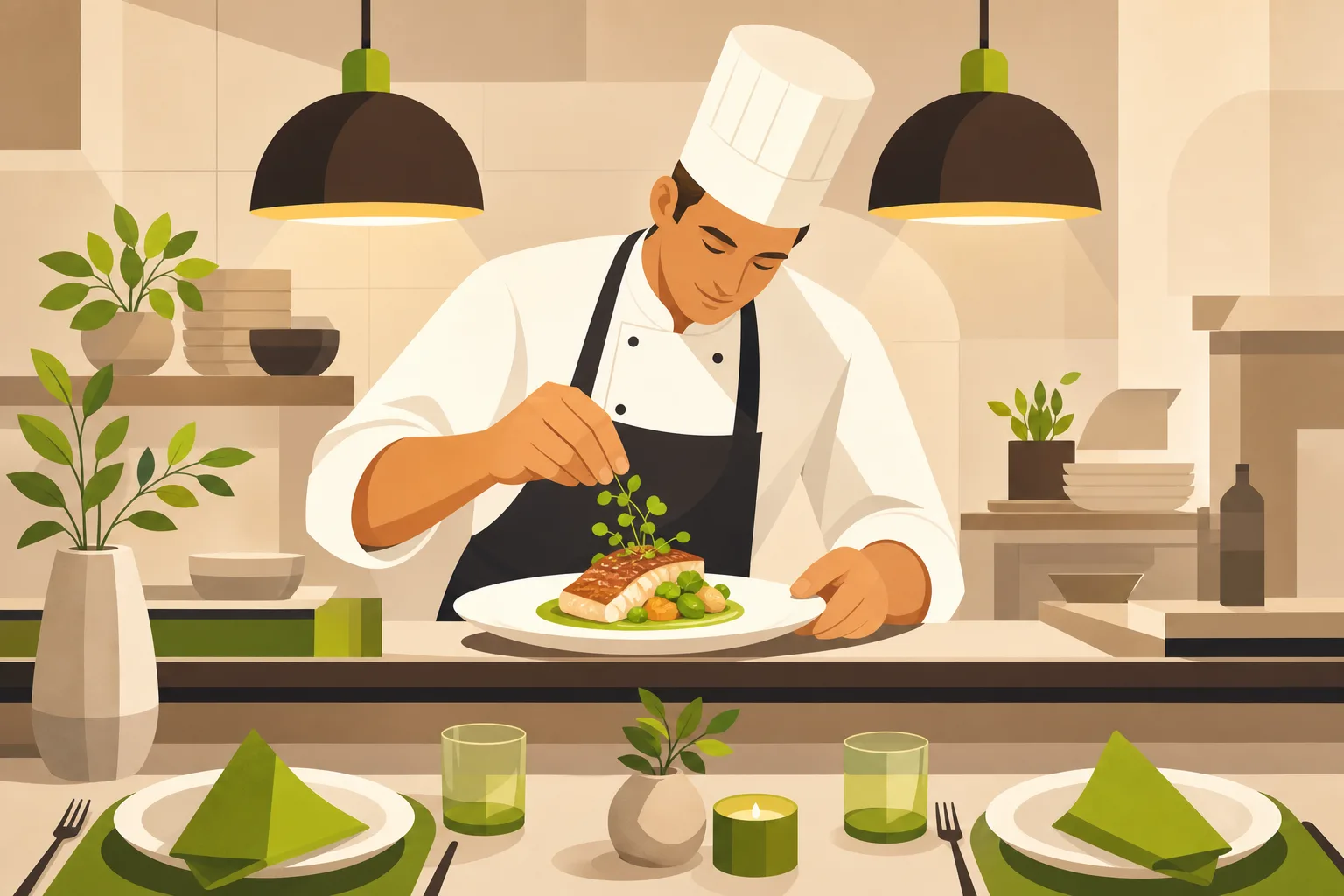
- What kind of food? A real photo of your best dish answers this faster than any headline.
- Where are you? The address needs to be on the homepage — not just in the footer, not just on a Contact page. One Nashville restaurant we analyzed leads with the street address as its actual headline. Extreme, but it works because location is the message.
- Are you open? Hours on the homepage. Always. If someone has to click to find out, they'll assume you're closed.
- How do I order or book? One primary button, above the fold. For counter-service and casual spots: "Order Online." For sit-down: "Reserve a Table." Not both, not "Learn More" — one clear action.
This isn't theory. The restaurant sites that ranked well and had the clearest conversion flows all surfaced these four answers without any hunting.
Trust signals that actually work for restaurants
Restaurant trust signals are completely different from, say, a plumbing company or a law firm. No one's checking if you're licensed. Nobody cares about your Better Business Bureau rating. What moves the needle:
Years in business is the single most powerful signal on every site we analyzed. "Since 1952." "Family-owned since 1986." "25 years of community." Every high-performing restaurant homepage we looked at leads with longevity. A one-year-old restaurant can't fake this — but a five-year restaurant that doesn't mention it anywhere is leaving trust on the table.
Named press and awards, specifically. "Award-winning" in quotes without attribution is almost meaningless — visitors have seen it on every Yelp-reviewed pizza place in town. "James Beard nominated," "featured on Food Network's Diners, Drive-Ins & Dives," "named to the Nashville Scene's Best Of" — those land. If you have press, name it. If you have a TV appearance, that clip is permanent homepage real estate.
Real embedded reviews with counts. One Nashville burger spot embeds five 5-star Yelp reviews directly on the homepage with names and dates. The specificity is what makes it credible. Generic star graphics aren't the same thing.
We see this pattern in adjacent food categories too — the same trust-signal hierarchy (longevity, named press, real reviews) shows up when we build sites for bars and breweries and cafes.
What a good restaurant homepage structure looks like
The best-performing sites we analyzed follow a consistent section order. It's not an accident — it maps directly to how a visitor moves through the decision:
- Hero — full-bleed food or interior photo, your name and one-line identity, Order/Reserve button
- Welcome blurb — two paragraphs, first-person plural, family/origin story if you have one
- Menu teaser — 3-4 signature dishes with photos, link to the full menu
- Online ordering or reservation callout — clear, repeated from the hero
- Events or entertainment — if you have live music, a patio, a beer garden, this is where it lives
- Press and awards strip — logos, quotes, publication names
- Gallery — real photography, not just food shots (interior, patio, team)
- Gift cards / newsletter (optional but common)
- Hours, address, phone, map — always near the footer, always on the homepage
Notice what's missing: no blog, no long SEO-page list of neighborhood keywords, no "7 reasons to dine with us" copy block. Real restaurant sitemaps are shallow by design. The best one we looked at had exactly 9 URLs. Your site is a brochure and funnel, not a content farm.
Common mistakes we see on independent restaurant sites
Photography that doesn't show the food. This is the most expensive mistake, and it costs nothing to fix if you already have a good photographer. The restaurant websites we analyzed consistently used real food and interior photography. Not stock, not illustrations. The industry data backs this up: photo menus convert roughly 25% better, and a significant share of diners report distrusting restaurants with low-quality photos. If your current photos look like they were taken on an old phone in bad lighting, this is your highest-leverage fix.
Burying the address and hours. We found this on multiple sites — hours accessible only via a Contact page click. Given that the majority of visits are mobile and impulse-driven, this is a conversion killer. Your address and hours should be readable on the homepage without any scrolling on most phones, or at most one short scroll.
Phone number missing. The best restaurant sites we analyzed show the phone number prominently on the homepage. Older diners especially want to call. "Call to reserve" is still a real use case. Don't hide it.
Leaking your vendor names in button text. One Austin restaurant's primary CTA button reads "Order On Chow Now." Naming your third-party vendor is awkward and looks unpolished. The button should say "Order Online" and the vendor widget handles the rest.
Hero copy that tries too hard. The best restaurant headlines we analyzed are identity statements, not benefit pitches. "Handmade. Homegrown. Historic." Three words, no explanation needed. "Austin's Original Tex-Mex Since 1952." Done. The visitor isn't reading a marketing deck — they're deciding if this is the vibe. Lead with who you are, not what you're trying to convince them of.
A note on color and design
Every restaurant website we analyzed uses warm, dark, or neutral palettes — earth tones, near-black backgrounds with warm accents, cream with real-photo color doing the heavy lifting. Zero sites used corporate blue. Your website's color palette should feel like walking into your dining room, not like a SaaS dashboard. Let your food photography carry the color; keep the chrome minimal and dark or warm-neutral.
The short answer: what your restaurant website actually needs
- Real food and interior photography. Everything else is secondary.
- Four answers in three seconds: what food, where, open now, how to order/book.
- One primary CTA above the fold, picked for your concept.
- Longevity and heritage in the hero or just below it.
- Named press and awards, not generic "award-winning."
- HTML menu pages, not PDFs.
- Address and hours on the homepage.
- Phone number visible.
- A shallow sitemap — roughly 9-12 pages is plenty.
If your website is doing all of these things, it's doing more than most local restaurants we analyzed. If it's not, the fixes are more structural than cosmetic — and the right starting point is a site built around how restaurant visitors actually behave, not a generic small-business template adapted for food.
If you run an independent restaurant and your current website was built years ago (or never built properly), GrowLocal builds restaurant websites designed from the ground up for how diners actually decide. We handle everything — design, build, and hosting — starting at $20-30/month. You can preview your site before paying a dollar. See the full range of local business websites we build, or go straight to restaurant websites to see what we put together for food businesses like yours.