


Updated June 2026
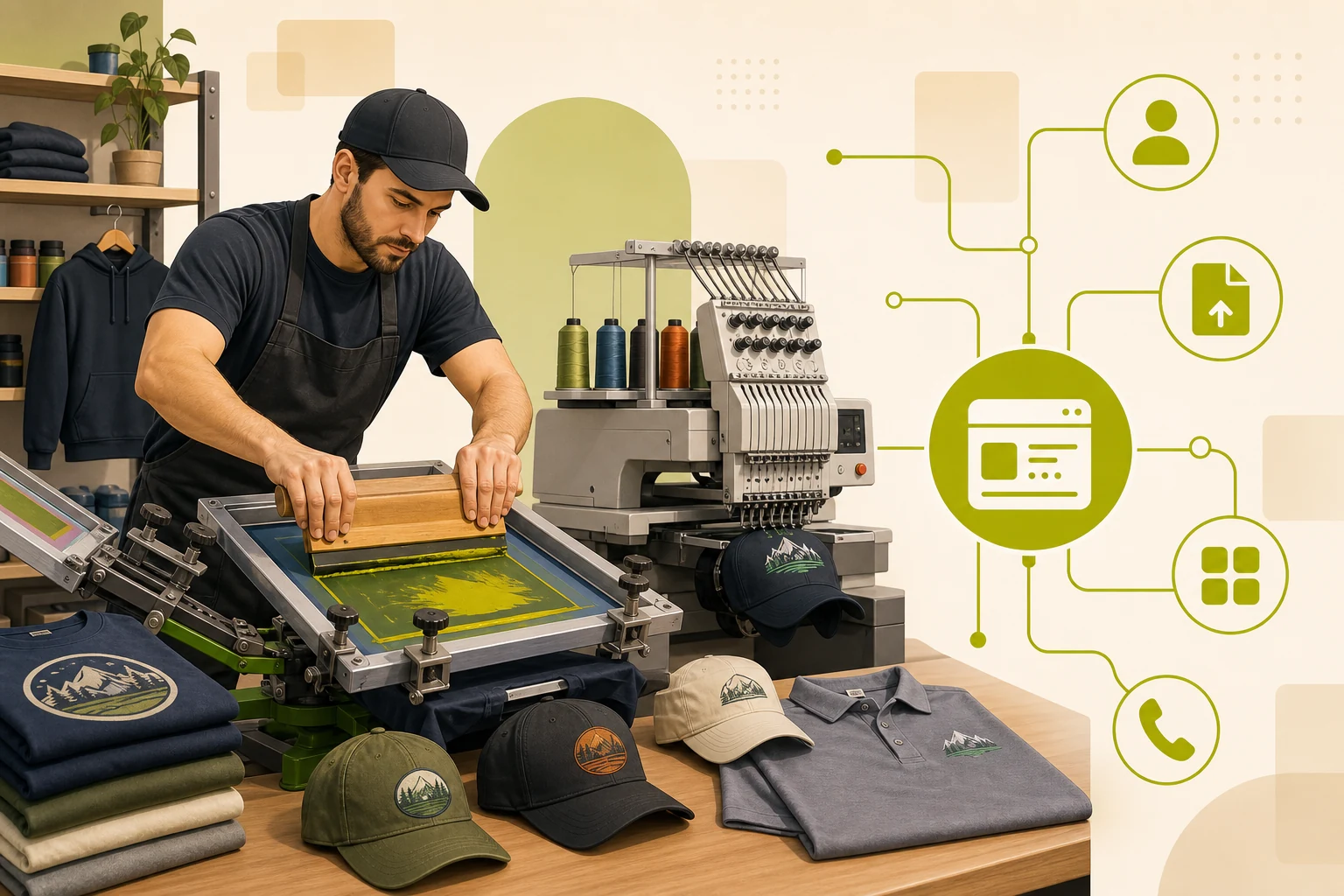
A screen printing website checklist covers six core areas: a quote-first hero, a portfolio section with real work, service pages for each print method, artwork file guidelines, trust signals (years in business, order accuracy, client logos), and a visible FAQ. Get all six right and your site converts browsers into quote requests. Miss even two and visitors go back to search results before they ever reach out.
Explore the data behind this guide on our local business website statistics page.
This is based on GrowLocal's proprietary research into top-ranking local business websites across Austin, Denver, and Nashville.
Does a screen printing shop actually need a checklist for its website?
Yes — most shops don't use one, which is why so many screen printing websites lose leads they could have won.
Across our research into top-ranking local business websites, the strongest screen printing sites shared a predictable set of elements. The shops that converted the most leads weren't the ones with the fanciest design — they were the ones that answered four buyer questions before the visitor had to ask: "Will my design look good?", "What's the minimum order?", "How long will it take?", and "I don't have a vector file — can you help?"
A site that answers all four, with specific proof, gets the quote request. A site that buries those answers doesn't.
Key takeaway: Across our proprietary research into local business websites, every top-converting screen printing site used a quote request form as the primary CTA — not a phone number, not a contact page, a purpose-built quote form. (See our full CTA data.)
What should the homepage hero include?
The hero is the first thing every visitor sees. For screen printing shops, it has to do three things at once: name the service, name the location (or service area), and make the next step obvious.
Hero elements that convert:
| Element | What it does |
|---|---|
| Headline naming the service | "Custom screen printing in [City]" — tells Google and the visitor exactly what you do |
| Primary CTA button | "Get a Quote" or "Request a Quote" — singular, not competing with "Shop" or "Learn More" |
| Trust line under the headline | "Since 1983" or "6,000+ happy customers" — one specific claim, not a vague promise |
| Phone number in the header | B2B buyers — teams, event organizers, corporate HR — frequently call on first contact |
What to skip in the hero: stock photography of strangers wearing generic shirts, five CTA buttons competing for attention, and any headline that could belong to any business in any category ("Quality. Service. Results.").
Which pages does a screen printing website need?
One homepage is not enough. Each major service and buying question needs its own URL so the site can show up in targeted searches and give each topic the space to convert.
Core pages (every shop):
- Home — portfolio samples, trust signals, quote CTA
- Screen Printing service page
- Embroidery service page (if offered)
- Gallery / Portfolio
- About / Our Story
- Get a Quote / Request a Quote
Additional service pages worth building:
- DTG (direct-to-garment) — addresses small-order and full-color requests
- DTF (direct-to-film) — increasingly searched, especially for performance wear
- Promotional Products
- Vinyl / Stickers
- FAQ page (standalone — more on this below)
Service sub-pages don't need to be long. They need a clear explanation of the technique, proof (photos of real work), a short FAQ about that specific method, and a quote CTA. A visitor landing on your DTG page is already interested — don't make them scroll back to the homepage to find the form.
Why does an artwork file page convert more leads?
Most screen printing websites skip this entirely — it's one of the highest-leverage pages in the category.
First-time buyers often hesitate to reach out because they're unsure if their logo file is "good enough." A dedicated artwork guidelines page removes that fear before the quote call.
What to include:
- Accepted file types:
.ai,.eps,.pdf(vector preferred);.psd,.pngat 300 DPI minimum - What "print-ready" means in plain English
- What happens if a client only has a JPG — do you offer conversion? At what cost?
- Font requirements (outlined vs live) and color mode (Pantone for exact match; CMYK for process)
If you offer free artwork reviews, say so. That one line converts hesitant first-timers who would otherwise not reach out.
What trust signals matter most for screen printers?
The trust signals that move the needle in screen printing are different from those in other trades. Reviews matter, but specific numbers matter more — because B2B buyers are evaluating risk, not just opinion.
Five trust signals ranked by impact:
- Founded date, prominently displayed. "Since 1975" signals equipment investment and production reliability to B2B buyers evaluating a new shop.
- Specific numbers. Across our research into top-ranking screen printing sites, shops with concrete stats — "99.7% order accuracy" or volume milestones — converted more credibly than shops using vague quality language. (See our trust signals data.)
- Client logo bars. A row of recognizable local brands carries more weight for corporate and school buyers than written testimonials alone.
- Named team profiles with photos. A named contact makes the shop feel like a business relationship, not an anonymous vendor — especially for first B2B orders.
- Visible process section. Design → Approve → Produce → Deliver, in 3–4 steps, directly addresses the most common hesitation: "I don't know how this works."
Put your strongest trust signal near the primary CTA — not in the footer where most visitors never scroll.
How should a screen printing site handle pricing?
The short answer: most shops don't post prices, and that's the right call — but it creates friction if the site doesn't address it.
Across our research, five of six top-ranking screen printing sites hide pricing entirely, relying on a quote-first model. Screen printing pricing is genuinely complex: it depends on color count, quantity, garment type, print method, and artwork readiness. A blanket price sheet often misleads more than it helps.
What works instead:
- Explain why you quote. A one-paragraph FAQ answer that honestly explains the variables (color count × quantity × garment × technique) builds more trust than silence.
- Set expectations. A "starting from" range is not a price sheet — it's a buyer prep tool that reduces abandoned quote forms.
- CTA near the pricing question. Place "Get a Quote" immediately after any pricing FAQ. Buyers reading that section are already deciding.
One standout pattern from our research: a shop with a live online instant-quote calculator that lets buyers estimate their own order. If your business model supports it, that tool works as a 24/7 lead-capture device.
What belongs in a screen printing website FAQ?
A FAQ page is one of the highest-ROI pages on a screen printing website. It captures long-tail search traffic, reduces pre-sale support volume, and pre-qualifies buyers who aren't sure if they're ready to reach out.
Eight questions worth answering:
- "What's the minimum order?" (give a number)
- "How long does an order take?" (give a range + rush option)
- "Do I need a vector file?" (plain English, not trade jargon)
- "Can you help if I don't have artwork?" (yes or no — if yes, say so)
- "What's the difference between screen printing and embroidery?"
- "What's the difference between screen printing and DTG or DTF?" (link to a comparison page if you have one)
- "Do you offer rush orders?" (timeline + cost)
- "How do I place an order?" (describe the 3-step process or link the quote form)
Keep each answer 2–4 sentences, self-contained, and written in plain English. FAQ content that reads like a legal notice doesn't convert.
What's the single biggest website mistake screen printing shops make?
Treating the website like a digital business card instead of a sales tool.
A brochure site says "here's who we are." A sales site answers "here's why you should trust us with your order." The difference is whether the visitor ends up on a quote form — or goes back to Google.
Every item on this checklist has a job: the hero names the service, the gallery shows proof, the service pages capture method-specific searchers, the artwork guidelines remove first-timer fear, the trust signals handle credibility, and the FAQ pre-qualifies buyers. When all six work together, the site does real sales work — not just display.
GrowLocal builds custom websites for screen printing shops with this structure already planned: core pages, mobile CTAs, gallery, FAQ sections, service pages, and local SEO. You preview the full site before paying and launch only when it feels right.
See how we approach websites for local service businesses across 90+ categories — the same evidence-based structure applies across trades. Our screen printing pricing guide explains what drives a quote and how a well-built site pre-answers buyer questions before the call. And our DTG vs. screen printing guide for shop owners covers how to explain your service mix on the site itself.
Frequently Asked Questions About Screen Printing Websites
What pages does a screen printing website need?
At minimum: a homepage, screen printing service page, gallery/portfolio, quote request page, and about page. Shops that offer embroidery, DTG, DTF, or promotional products should add a dedicated page for each — those pages capture searchers who already know what they want.
Should a screen printing website show prices?
Most successful screen printing sites don't post prices because color count, quantity, garment, and technique make upfront pricing misleading. What converts instead: a brief explanation of what drives the quote, and a quote CTA placed immediately adjacent to any pricing question. Buyers who read a pricing FAQ are already in buying mode — don't make them hunt for the form.
How important is a portfolio or gallery for a screen printing website?
It's the second most important element after the quote CTA. Across GrowLocal's proprietary local-business website research, every top-performing screen printing site used real product and process photography — printed apparel worn by real people or laid flat, production shots, team at work. Buyers need to see your actual work before they reach out.
Does a screen printing website need to be mobile-friendly?
Yes, without exception. Teams, event organizers, and school coordinators frequently browse and submit quote requests from phones — often at the event itself, under a deadline. A site that's hard to use on mobile loses those leads before they ever reach the quote form.
How do I get more quote requests from my screen printing website?
Place "Get a Quote" in the header, hero, and at the end of every service page. Add one specific trust signal adjacent to each CTA — a founded date, an order accuracy stat, or a client count. Keep the form short: name, email, phone, quantity, and a notes field. Every extra required field reduces submission rate.